


Rooftop Cinema


Craig Redman created a series of characters seated in striped deck chairs, a reference to the venue's signature seating. Shown here: "Revenge of the Nerds". At top, Fear and Loathing in Las Vegas".
One look at the Rooftop Cinema website and it's clear this is no run-of-the-mill megaplex. Australian artist Craig Redman created the print campaign for the Melbourne institution and Jonathon Bellew and James Yencken of Something Splendid brought it to the web.
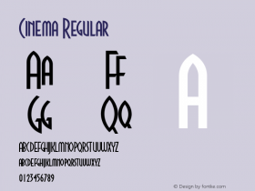
For the logo, Redman started withTrade Gothic Condensed Bold No. 20. Lowering the waistline (see 'R' and 'P') can completely change the look of a typeface, and it's a simpler task when the design has straight sides.
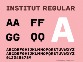
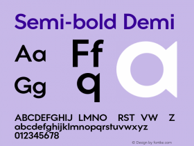
The overall identity called for all caps type, so Bellow and Yencken had to spec a condensed webfont that would fit film titles and paragraphs of copy into narrow columns. A gothic or geometric sans wouldn't suit the colorful, casual character of the site nearly as well as their choice, nor would it be as readable.Ronniais a contemporary humanist with a subtle flair. The Semi-bold weight holds up well on a black background under both OS X (heavy) and Windows (cruddy) antialiasing. Though readers might beg for lowercase and a lighter weight on pages with longer copy.
The Rooftop Cinema ID is reinvented annually and has a history of interesting type choices — here is 2009 and 2008 — but I think this season's look is the strongest.


 闽公网安备35010202000240号