


Ford Trucks TV Spots


Parked in my driveway are two decidedly non-macho vehicles, both nearly 15 years old. I freely admit that I'm not a "car guy". That said, I love the surge of typographic testosterone that Ford has been unleashing since 2009 to sell their F-150 and Super Duty pickups.
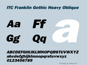
UsingITC Franklin Gothic Heavyand a bevy of inventive motion graphic techniques, the commercials are full of witty type treatments, perfectly complemented by the guys-talking-to-guys voiceover (initially by snarky comedian Denis Leary, currently by a sound-alike). When the spots (created by New York design/animation firm Offspring) first aired in 2009, the type and overall effect was fairly two-dimensional, with angled layouts that recalled Constructivist posters. Type in the 2011 incarnations is often three-dimensional and casts shadows on the highways, work sites and other manly scenes where the trucks earn their keep.
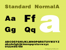
Speaking of Franklin, if you've ever found the great American Gothic short on widths or weights check out David Berlow's completely revised digitization,ITC Franklin, jointly released by ITC and Font Bureau in 2008. The payload? 48 styles. Proportional figures, fractions, Extended Latin, and even unicase glyphs come standard.


Update:Agency Team Detroit has more info and samples from the campaign.


 闽公网安备35010202000240号