


The Typographic Monotony of American Retail


Campaigns from Home Depot, Kohl's, J.C. Penney, and Gap.
There is a lot of Sturm und Drang about the ubiqitous use ofHelvetica/Arialand the like, bombarding public life, selling us everything from power tools to makeup.
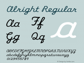
I don't want to Spiek for anyone else, but my Twitter feed is full of Helvetica commentary, which at first was a nice respite from the Comic Sans ass'ination, but now seems to be bordering on futility. The battle is lost. Now we must wait for the gravitational pull to work its magic and we can rest assured that the tide will rise again to American Gothics —Benton Sans,Franklin,Gothamor contemporary European sans serifs, likeFF MetaandFF Unit; or maybe even some of the juicy new designs I see popping up:Ardoise PTF,Alright Sans,FF Basic Gothic,andFounders Grotesk.
Typefaces Used by Top 20 US Retailers
| Best Buy | Futura, Knockout, Apex Sans |
| Costco | Avenir |
| CVS | Helvetica |
| Gap | Helvetica |
| Home Depot | Stencil, Helvetica |
| JC Penney | Helvetica |
| Kohl's | Helvetica, Bodoni |
| Kroger | ITC Avant Garde Gothic, Helvetica |
| Lowe's | Helvetica, DIN |
| Macy's | ITC Avant Garde Gothic, Myriad |
| Publix | Minion, Franklin Gothic |
| Rite Aid | ITC Avant Garde Gothic, Romeo, Helvetica, Gotham |
| Safeway | Metro, Frutiger, Helvetica |
| Sears | Helvetica |
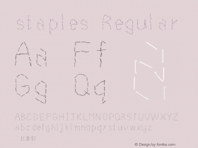
| Staples | Stencil, Helvetica |
| TJ Maxx | Helvetica |
| target | Helvetica |
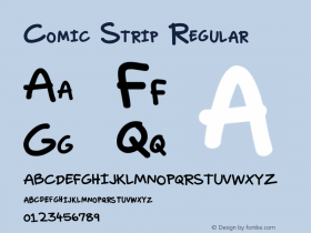
| Toys "R" Us | Comic Strip, Avenir |
| Wal-Mart | Myriad, Helvetica |
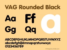
| Walgreens | VAG Rounded, Interstate, Helvetica |
Top companies from the "Specialty Retailers", "General Merchandisers", and "Food and Drug Stores" industries in the Fortune 500, listed in alphabetical order.
I am not a frequent retail shopper or TV viewer, but this year I rented a ski house with cable for the holidays and wandered through several malls. As I took in the American retail experience, I felt as if the Twitter feed was implanted into my brain like a Ray Kurzweil moment of singularity. I was living the feed. If not for a few visual godsends from Best Buy and Nordstrom, I was bombarded with what my German friend calls "lazy design hooligans".
Years ago I asked a member of the AOL design team, why their mailers were so, uh, pedestrian. I was told in no uncertain terms that they were mailing the free discs in packaging that was carefully designed to not be "too hip or slick". Their goal was to appeal to the mothers shopping for groceries.
In an age when thoughtful design is more accepted and understood than ever, I think American shoppers could handle a little bit more — dare I say — sophisticated typeface selections. Here's the painful proof: 15 of the top 20 retailers on the Fortune 500 use Helvetica in their main identity or current advertising campaigns.

Nordstrom is one of the few major U.S. retailers not using Helvetica. This is Interstate.


 闽公网安备35010202000240号