


Cloudberry


Jefferson Perky designed the new identity for interactive design studio Cloudberry. The logo, website, and printed materials all exude a friendly but capable attitude. It's clear from the start that these guys build things with humans in mind.

A lovely page of text announcing the new brand. Slashes are set in a lighter font to avoid overwhelming the text.
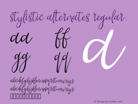
Angus Shamal'sARS Maquetteis at the root of that expression. The typeface — a very 21st century take on 19th century sans serifs like Akzidenz Grotesk — embodies clarity, simplicity, and warmth all at once. The latter aspect is owed in part to Maquette's stylistic alternates, informal forms of 'a', 'l', and 'y' as well as tailed italics.

Roman, Italic, and Display stylistic alternates available in ARS Maquette Pro.

Helvetica's horizontal terminals are a defining characteristic, a part of its mechanical beauty. ARS Maquette's strokes end more naturally, giving it a more informal personality.
Even when those more casual characters aren't visible Maquette retains its relaxed stance via its proportions (a massive, nearly unicase x-height) and open shapes (strokes that end on an angle). It's this kind of a terminal which gives Grotesques like Maquette a warmer feel than Helvetica whose strictly horizontal terminals make the typeface more rigid and cold, no matter how cozy the surrounding colors or copy.

 The positive, user-friendly nature of the brand is taken one step further with the symbol, a 'C' derived from Maquette, trimmed and rotated to reference a smile. Stamping the symbol on business cards is a nice personal touch, adding some human variation.
CloudberryCreative.com is set entirely in a self-hosted web licensed version of Maquette. Paired with two colors and just a few simple spot illustrations, the typeface is enough to set the site apart.

Click to enlarge.

Click to enlarge.
There's just one aspect of the web design where the user (reader) was overlooked. Perky went full-on with Maquette, using it for every bit text on the site. The result is less optimal in tiny bits where this version of Maquette lacks the hinting required for high quality display at certain sizes. Lucida Grande/Sans would be a better choice for the small stuff until the upcoming web-optimized versions of Maquette is available. Even then, I wonder if the typeface's relatively tight spacing precludes sub-14px text, no matter the hinting. A healthier dose of tone contrast between the type and background would go a long way as well. Fortunately, the site zooms quite gracefully. Bump it up a couple notches and the entire experience is a pleasant one.

The beautifully on-brand contact page at CloudberryCreative.com.
In all, Cloudberry is another good example of how a typeface can be the foundation of an identity.


 闽公网安备35010202000240号