


Communication Arts Typography Annual 2


For the second consecutive year Erik Spiekermann, information architect, type designer and author of books and articles on type and typography; and Tiffany Wardle de Sousa a.k.a. "Typegirl", a typographer and graphic designer.
Communication Arts Typography Annual 2 cover: "Typography Annual Two" and the glyph set in FF Sero, an original typeface by Jörg Hemker (p. 171), and two selections from designer Doug Pedersen's Futureglyphics series (pp. 205 & 209).
1,723 entries were submitted for this second Typography Annual, less than the inaugural competition, but probably a more accurate reflection of the quantity of work produced in a single year. Again, the organisers were pleased with the international nature of the submissions, especially in the typeface category, and the inclusion of several non-Latin typefaces.
Juror Tiffany Wardle de Sousa:
In general, I really enjoyed most of the work. For me it was important to consider each project separately because viewed as a whole I sensed a sameness.
That sameness might best be explained by identifying the most common visual trends.
Juror Erik Spiekermann concurs:
The lock-up look was a prevailing theme. Pages were full, and if it wasn't the page, then a shape was filled with type. From clouds to trees, everything served as a lock-up for letters.
Juror Richard Kegler added:
The 'handmade' and retro pastiche have really become a major trend. The lack of actual type vs. hand lettering was surprising.
In closing, Wardle de Sousa offered this:
Typography is typography, no matter the media. Hopefully the technology innovators will always keep the rules of typography in mind as they create.
Erik Spiekermann:
The state of typography has always been a good indicator of the general state of affairs. The trends were all pointing back in time, pastiche being the operative word, nostalgia the main trend.
Digital media – Poem Script slideshow | Typeface: Poem Script | Director: Santiago Idelson
The winning entries are spread over different categories, one of them being type design. The following typefaces were selected to be included in the Annual:
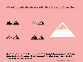
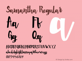
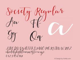
Steinweiss Script| Michael Doret, Alphabet Soup Type FoundersSocialism| FontBitBe Serif| FontBitFF More| Łukasz Dziedzic, FontFontFF Sero| Jörg Hemker, FontFontFF Spinoza| Max Phillips, FontFontAria Pro| Rui Abreu, Fountain TypeSmidgen| Ken Barber, House IndustriesBarun Jiwon Book| Jiwon LeeDIN Next Arabic| Nadine Chahine, LinotypeNeue Haas Grotesk| Christian Schwartz, LinotypePalatino Sans Arabic| Nadine Chahine, LinotypeHiatus| Stephen RappPoem Script| Alejandro Paul, SudtiposSemilla| Alejandro Paul, SudtiposChartwell| TK TypeRegal Finesse| Panos VassiliouSamantha Script| Laura WorthingtonAlana| Laura Worthington
A sampling of the winners – some random entries, one per category:
Packaging – Fog Mountain wine bottle | Client: Boisset Family Estates | Creative Director: David Schuemann | Designer: Kevin Reeves | Design Director: Sara Golzari
Advertisement – Huawei Ideos X1 | Client: Huawei Technologies Co. Ltd. | Agency: ArnoldFurnace
Books – Society of Graphic Designers of Canada Annual Report 2009/10 | Client: Society of Graphic Designers of Canada | Agency: Foundry Communications | Creative Director: Zahra Al-Harazi | Designers: Kylie Henry, Janice Wong, Jake Lim | Illustrators: Kylie Henry, Jon Jungwirth , Jake Lim, Janice Wong, Emmanuel Obayemi | Writer: Kitty Wong
Identity – Roman Rockwell | Client: Chris Gardner | Designer: Ken Barber
Poster – SOGO Japan | Designer: Neil Summerour
Motion – $amy Deluxe "Poesie Album" | Director: Felix Paul | Co-director: David Königsmann | Art Direction, Motion Design & Artwork: Nico Uthe, Bastian Böhm | Artwork support:
Typeholics, Lars Paukstat, Scotty Paschke, WES21, Jan van der Torn | Kamera: Moritz Schultheiss | Produktion: David Mohn (noyz'R'uz)
Ephemera – Jaime Stoltz & Anthony Ekman wedding invitations | Design: Kate Holgate
Miscellaneous – Classic book cover series – Client: Sterling Publishing / Barnes & Noble | Art Direction: Jo Obarowski | Design: Jessica Hische


 闽公网安备35010202000240号