


"Matthew Barney: Drawing Restraint" at SFMOMA

导语Source: http://www.flickr.com.Uploaded to Flickr by Stephen Coles


Source: http://www.flickr.com.Uploaded to Flickr by Stephen Coles and tagged with "itcfranklingothic". License: CC BY-NC-SA.
Predictably, my favorite part of the Drawing Restraint exhibition was the one with the most text on the wall: the explanation room.
SFMOMA's gallery designers do exquisite work. All the type is readable, regardless of the distance from the viewer. And it's always understated, but appropriate for the exhibition.
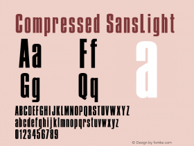
Font: ITC Franklin Gothic Compressed Demi and hyper-obliqued for the show title.

Source: http://www.flickr.com.License: All Rights Reserved.

相关字体家族


相关字体设计师

"Matthew Barney: Drawing Restraint" at SFMOMA 网友点评
"Matthew Barney: Drawing Restraint" at SFMOMA 最新评论
暂无相关评论


推荐字体资讯

 闽公网安备35010202000240号