


Avalon Hotel


Source: http://www.flickr.com.Uploaded to Flickr by Stephen Coles and tagged with "japanscript". License: CC BY-NC-SA.
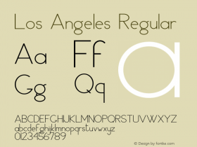
Custom lettering based on Paul Renner drawings and Japan Script as digitized from Solotype.
Excerpt from Redesigning Identity, by Catharine Fishel in U&lc 28.1.1:
The wordmark for the Avalon Hotel in Beverly Hills, California, conjures a completely different feeling: that of rest and rejuvenation. Its acronym says it all: "Ah."
Created by Reverb of Los Angeles, the wordmark for the historic hotel had to reflect the building's architecture, as well as its history of being a quiet hideaway for such stars as Lucille Ball and Marilyn Monroe. Retaining a retro look was a must.
"Since the Avalon is a 1930s Beverly Hills landmark with interiors and original tile work by Alvin Lustig, we wanted to celebrate its roots as much as possible while creating an identity that crosses timelines," explains Susan Parr, creative director at Reverb. "We selected a squared-off sans-serif face, in part because the geometric forms reflect the hotel's main exterior architectural features."
A hotel logotype, especially one created for a design-focused boutique hotel, must hint at the guest experience the hotel offers, says Parr. This mark, constructed from a face that was found in an old type book, echoes the hotel's strong, horizontal entry, the dominant square-patterned tile on its façade, and its modern, minimal and entertaining interiors.
A companion script face, muted color scheme, flower/atom element, and the "ah" tagline work together with the wordmark to present an inviting picture of the hotel's offerings. "The Avalon's typography was designed to convey the Avalon's brand promise to guests: that of a hospitality experience and staff culture of design and service," Parr says.
Martin LAllier on Typophile:
According to the author of the logo:
"The logotype is custom and was inspired by two typefaces. The letterforms in Avalon are based on sketches that Paul Renner did for an alternate version of Futura. Hotel is set in Japan Script which was digitized from the Solotype archive."

Source: http://www.flickr.com.License: All Rights Reserved.

Source: http://www.flickr.com.Photo by Brooke Castro. License: All Rights Reserved.


 闽公网安备35010202000240号