


Twitter个人资料页面启用Gotham新字体 曾用于奥巴马竞选

导语最近几周Twitter所有的用户界面进行布局调整和重新设计之后,今天公司再次决定对整个网站的视觉体验进行重大调整。今天公司宣布已经
最近几周Twitter所有的用户界面进行布局调整和重新设计之后,今天公司再次决定对整个网站的视觉体验进行重大调整。今天公司宣布已经放弃Helvetica Neue字体转而使用Gotham字体,该字体是由Tobias Frere-Jones设计,在奥巴马首次竞选时候大量使用。目前用户的个人资料页面已经调整,主界面、通知和搜索页面未来也有望进行改变。
Twitter解释到:“我们使用Gotham家族字体的原因是因为该字体优雅而直接,时尚但不排他。在我们的产品中通过整合这些设计良好的字体能够提升我们的用户体验。”尽管如此这种改变并不让所有人满意,比如下面几位用户。

相关字体家族
-
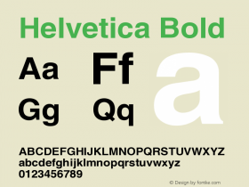
 Helvetica Neue
- Regular
- Medium
- Bold
- Italic
- Heavy
- Bold Italic
- Unknown
- Light Italic
- Thin
- Light
- Ultra Condensed
- Thin Italic
- Medium Italic
- Black Italic
- Black
- Bold Condensed
- Bold Outline
- Bold Oblique
- Condensed Black
- Condensed Bold
- Condensed Oblique
- Medium Oblique
- Black Oblique
- Light Condensed
- Heavy Italic
- Heavy Condensed
- Heavy Condensed Oblique
- Light Condensed Oblique
- Medium Condensed
- Medium Condensed Oblique
- Heavy Oblique
- Black Condensed
- Light Oblique
- Thin Condensed
- Thin Condensed Oblique
- Thin Oblique
- Bold Condensed Oblique
- Ultra Condensed Oblique
- Ultra Light
- Ultra Light Italic
- Expanded
- Condensed
- Black Condensed Oblique
8091 关注 -
 441 关注
 -
 1009 关注
 -
 34394 关注
 -
 4557 关注
相关字体设计师

Twitter个人资料页面启用Gotham新字体 曾用于奥巴马竞选 网友点评
Twitter个人资料页面启用Gotham新字体 曾用于奥巴马竞选 最新评论
暂无相关评论


推荐字体资讯

 闽公网安备35010202000240号