


ScreenFonts: Chronicle, Perfect Sense, The Innkeepers, Bullhead, Gone


Well, my trip and Typekit engineer and web developer webfonts in his excellent interview about her gorgeous poster for Life During Wartime.
Unfortunately my own talk was not so well attended. Whereas I currently am a mid-level speaker at typography conferences, I was a virtual nobody at SXSW. Being scheduled against the hyped up Everything is a Remix; So Steal Like An Artist on the same track in the big auditorium right next door meant I was dead in the water. Judging from the reactions on Twitter however Two Decades of Trajan in Movie Posters went down really well with the audience. People said it was very well prepared, very interesting and entertaining, an excellent, real fun talk, brilliant, fantastic, and the amount of dedication in my research was appreciated. Marjolijn Kamphuis tweeted that font and movie lovers who didn't show really missed out on this session, a refugee who was shut out of the most popular sessions thought it was fascinating, and one commenter even labelled it a hidden gem. I hope a few more people will show up at TYPO SF on Friday, April 6 at 2pm, which will possibly be the last time I give this presentation.
Before we get started with an overview of the most interesting movie posters from last month, a warm welcome to any new readers who decided to visit The FontFeed after attending my panel at SXSW. I hope you enjoy the ride.
An interesting premise when designing collaterals for films is inhowfar the particular visual style or concept of the film it advertises should inform the design of the poster. [Rec], and Cloverfield as more recent examples. Yet this is the first time I have seen one of this kind of films transpose its look so successfully to its poster.
Although the aesthetic of the poster reveals that Ignition Print clearly knew what they were doing, the framing of the picture was intentionaly made to look a little haphazard. The horizon is tilted, and instead of having the three main characters front and centre, they are barely visible in the upper right region of the image. The eye of the viewer is cleverly attracted to them by the movie logo set in all caps Neue Helvetica Extended. Making it transparent minimises the impact of the type on the image, allowing the poster to achieve a delicate yet thoughtful balance between its different components.
Alas the alternate designs by Midnight Oil Creative lack the subtlety of the original. The car balancing on a tower mast at the top left tries a little too hard, and the grainy image quality can't disguise that the composition is too balanced and "regular". Yet I can appreciate the humour of the "Boys will be boys" tagline. The other three however have no link with the concept of found footage – the ensemble poster is pretty generic badassery, the cloud flipping the bird really tries too hard, and the design with the explosion looks like a run-off-the-mill action flick one-sheet.
As usual I am bemused as to why a different wide grotesque was used for these four posters. Is there no communication between the agencies and the studios. Are there no guidelines to help achieve a consistent branding for the film? Did Midnight Oil Creative think the original Neue Helvetica was too commonplace and substituted it for what I believe to be the deliciously chunky Annonce (I doubt this is Standard Extended Extra Bold)? I guess we'll never know.
When opting for weathered type you can either choose to "grunge up" clean letters or use an out-of-the-box distressed typeface. The latter are very practical, yet identical wear in repeating letters negate the desired effect. This can be seen in the movie poster for Perfect Sense featuring Rian Hughes' Coldharbour Gothic. The identical four "E"s and two "S"s make it abundantly clear that this is not genuinely worn type.
A much better result can be achieved very easily. Because Coldharbour Gothic is an all capitals typeface, Rian chose to have characters with different wear in the lower-and uppercase slots. Switching a mere three letters to lowercase – PERFeCT seNSE – gives the result above, in which the identical characters are a lot less obvious.
Whereas the top poster ever so faintly references Saul Bass, this very commercial design (not in a good way) looks dated, as if it was designed in the early nineties. The only clue that this is a contemporary design is the use of Gotham as supporting typeface. The fact that it was used for the actors' names (default option) and not the film title (conscious selection) proves my theory that in less than four years time Gotham has already reached the stage of being regarded as the standard movie poster font.
I am quite impressed by the quality of the posters for The Innkeepers. The
original design is a delicious throwback to illustrated 80s movie posters. The hotel, the silhouette of keys as gravestones and the creepy ghostlike face in the beautifully painted sky are rendered in a eerie blue/green palette with pale yellow accents. The typeface nicely complements the atmosphere and fits the time period evoked by the design. In Mark Simonson's own words Bookmania is "a revival of the classic ATF Bookman Oldstyle and the Bookmans of the 1960s. But it's not a slavish replica. It's my own idea of what Bookman could be. It's the revival I always wished someone would do."
I thought about doing a cursive italic, like others have tried, but in the end I decided that the original slanted roman should be preserved. Bookman has always been known for its swashes, so I also made a superset of the dozens of swash characters that have been added to Bookman over the years.
I wanted to go beyond its past and make something new. I added things that Bookman never had like small caps, old style figures, alternate characters, ligatures, stylistic sets, extensive language support, and more.
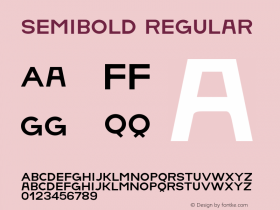
The family is composed of five weights—Light, Regular, Semibold, Bold, and Black, plus italics.
It's my love letter to the classic Bookman: Bookmania.
Freelance art director, designer and illustrator for film key art last year – created two alternate posters. He details the genesis of the Art Nouveau-influenced design on his blog The Dude Designs. Just like with Hobo With A Shotgun Hodge landed this job by simply sending an email to Larry Fessenden at Glass Eye Pix / Scare Flix, saying how he has been a fan of their films for ages. Hodge mentioned he just did the Hobo poster and told Fessenden that if they needed any posters designs for upcoming films, he was their man. Next thing he knew Hodge got an email from Fessenden asking him to do a poster for Ti West.
Hodge got to work quite closely with the director while the film was still in production, yet never actually got to see a frame. Instead West sent over a selection of film posters and a write-up which set the tones he wanted to present in the final poster. Like most people Hodge was expecting full-on horror, but West stressed that The Innkeepers wasn't going to be a straight-up horror film, more a G/PG-rated movie in the spirit of Peter Jackson's The Frighteners, Victorian ghost stories, Charles Dickens' A Christmas Carol and even Ghostbusters. Of the ten different concepts this poster was one of the last Hodge did; it was also the design that had that eureka moment. After doing quite some research into Victorian design styles Hodge eventually got drawn towards the Art Nouveau movement because the wavy lines and curves set the tone so well. Then he also looked into old ghost story book covers to capture a more light-hearted spooky vibe, finding The Fontana Book of Great Ghost Stories anthology with their amazing illustrations a massive inspiration. Finally Hodge cites Drew Struzan as a big inspiration, especially because he wanted to set that 80s Goonies / Adventures In Babysitting montage poster vibe.
For the final design the ethereal lines of the Art Nouveau border were blended with the ghostly mist. The composition exists in three planes – the mist in the foreground, the two intrepid ghost hunters walking through the mist with a torch in the middle, and the ghost wrapping around and framing the whole scene appearing in the background. Hodge added an element of humour by playing with the stereotypes, having Sara Paxton pose as the lead character and Pat Healy hiding behind her. This also allowed him to emphasise their spooked expressions with the torch light. The green/blue colouring was inspired by old oxidised copper to give it that antique ghostly feel.
For the hand-drawn title design Hodge found inspiration in the typical reverse glass, gold leaf engraved lettering on old pub signs and mirrors. Overemphasising the spirals and curves suggested spookiness and made the title tie in with the Art Nouveau style. The subtle pigeon and deer head link back to the film and actually are hints to the storyline which become clear when watching The Innkeepers.
The second alternate poster is about as minimal as Hodge gets. More a teaser poster, it was selected as an extra because Ti West and Larry Fessden liked the concept so much. Although it is very much designed as a homage to the serious mystery/thriller posters of the 70s, again it incorporates that Victorian vibe harkening back to the hotel's mysterious past. During his explorations into all things Victorian Hodge came across designs for ornate key hole protectors. They where incredibly elaborate – as most Victorian things are – with flowing and curling fleurs; stylised decorative ornaments that resemble the fleur-de-lis (lily flower) details which Hodge thought had this real sinister edge. He reworked and slightly overemphasised them to make them appear like clawing hands that draw you into the darkness of the key hole. Hodge originally wanted to have the ghost peak through the key hole, but it was Ti West's idea to leave it empty key hole so the imagination of the viewer could fill in the blanks. While I am pretty sure the movie title is hand drawn, the supporting typeface is 70s design ITC Quorum.
Hodge says that the great thing about both posters for The Innkeepers is that creatively he was able to reference the rich history of Victorian design, allowing them to have some historic substance rather than simply be "grindhouse posters" which would have totally given off the wrong impression.
Although I loathe nationalism I can't help but feel a tinge of patriotic pride talking about the excellent Belgian film Rundskop (Bullhead) which was nominated for the Academy Award for Best Foreign Language Film this year's Oscars. The original poster is very powerful, prominently showing the silhouette of Matthias Schoenaerts' massive shoulders – he gained 27 kilos for the role – and bloated cattle at the bottom. The centred typography – bold all-caps FF DIN – is equally strong and well-integrated in the image.
The international poster is not as good, because it both shows too much and too little. Gone is the symmetry and the mystery, and that hurts the composition.
On the Reelizer website I found a gorgeous alternative interpretation by Jay Shaw a.k.a. Iron Jaiden. Man and bull merge into a mythical hoofed beast whose arms morph into twisting horns. I don't quite understand the concept behind the hand lettering, so I can't really comment on it.
I am a fan of creative use of silhouettes, and the movie poster for Gone is a perfect example of a combined effect. The outlines of the disappeared sister's body frame Amanda Seyfried's portrait, and the highlight in Amanda's hair in turn holds the silhouette of the person responsible for the disappearance. The interplay between light and shadow produces an intriguing multi-layered image that – even though it looks slick and commercial – I find very appealing. All hope is not lost… ; )


 闽公网安备35010202000240号