


Brighton Festival 2012 Poster

导语Source: http://brightonfestival.org.Image © Brighton Festival. Li


Source: http://brightonfestival.org.Image © Brighton Festival. License: All Rights Reserved.
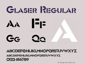
Harrison and Co designed this year's Brighton Festival look and feel. After hearing about the themes of the Festival they created an lead image that uses Victor Skrebneski's iconic photograph of Vanessa Redgrave from the 60s, the scene from Sandro Botticelli's Birth of Venus and Milton Glaser's Bob Dylan poster as points of inspiration.
— Brighton Festival Official Site
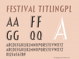
The poster uses the typeface Progress, which appears to be modified to reference Rennie Mackintosh, leading Gareth Hague, designer of the typeface, to remark on Twitter:
Oddest use of Progress.
An unaltered Progress is used throughout the branding, including the website.

相关字体家族


相关字体设计师

Brighton Festival 2012 Poster 网友点评
Brighton Festival 2012 Poster 最新评论
暂无相关评论


推荐字体资讯

 闽公网安备35010202000240号