


Interview: Dalton Maag's Bruno Maag on creating Nokia's Pure – a typeface for the whole world

Bruno Maag discusses his bold quest to create a font that lets you say anything in almost any language.

Most mobile phones use a mishmash of fonts to represent the different character and script systems from around the world: from the fixed forms of Latin and Cyrillic to the elegant cursive letters of Arabic. Phone makers generally buy in existing typefaces, paying scant attention to how they work alongside each other once users of non-Latin scripts start peppering their communiqués with Western pop-culture loanwords.
Nokia is trying something different. Over the past year, it has engaged the services of master type designer Bruno Maag and his foundry Dalton Maag to produce a custom typeface, called Pure, that spans most of the major script systems – a job that will likely take up most of this year too.
Seven script systems have been finished and are with Nokia for testing: Latin, Greek, Cyrillic, Arabic, Hebrew, Devanagari and Thai. Now Bruno and his team are about to begin on their biggest challenge: Chinese, with its requirement of 27,500 characters (as stipulated by the Chinese regime). Japanese will follow. Each script has been designed to complement the others in both size and style when sitting next to each other on screen.

Nokia Pure's versions include (above, top to bottom) Latin, Cyrillic, Greek, Devanagari and Hebrew – and (below) Arabic.

The typeface has spawned a book published by Gestalten, and won the graphics category of the London Design Museum's Designs of the Year 2012 awards. It has had its detractors too. Bruno paraphrases his regular verbal sparring partner Erik Spiekermann – who designed Nokia's previous typeface Nokia Sans – as saying, "I did something much better. At least what I did had personality."
"But that was the problem," says Bruno. "What Spiekermann did with his typeface – and it's a great typeface – is he gave it so much personality that Nokia couldn't work with it anymore."
What Bruno means by this is that a mobile font needs to be, he feels, "deliberately bland, with relatively little personality", to be flexible enough for all the different things it might be used to say. It needs to feel as comfortable delivering tragic news in a tweet as when sending a ribald joke to friends, and as appropriate for a flirty message to your partner as an always-too-tardy reply to your mum. Legibility and comfort at small sizes was also a priority.
"Right from the start, Pure was designed to be a UI font – print was always a secondary consideration," says Bruno. "A glance at it should make sure you can instantly read what you see, while [the font is] soft and comfortable enough to read 100 messages. This is why the letters have a Humanist and open shape to them – there's very little ambiguity between character shapes."
Hebrew and Arabic were the first two script systems Dalton Maag worked on. Bruno describes designing day-to-day Hebrew as relatively simple, but Arabic involved an unexpectedly tough choice between its two main calligraphic systems, Kufic and Naskh – the former squarer, the latter rounder and more flowing (Bruno likens the distinction to that between sans and serif Latin fonts).
With Latin script, the problem at small sizes is distinguishing letters due to the 'digital inktraps' of pixels that blur fine detail. With cursive scripts like Arabic, the issue is detecting where one character ends and the next begins.

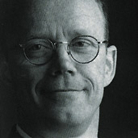
Bruno (above) picked Kufic as being more suitable for short messages and info blocks. "Kufic is primarily used for small passages of text in display environments," he says. "It has very strong horizontal and verticals [aiding legibility when you're viewing pixels]. You can keep the x-height relatively high. In Naskh, the x-height is really small, so it becomes very difficult to [see] where one character stops and the next one begins."
Kufic may be the more legible, but Nokia's testing introduced Bruno to a different issue – the politics of the Arabic script. "Arabs love the Kufic that we've done, but Persians prefer their scripts a little softer," he says. "They say [Pure] feels too Arabic. It's not that they can't read it, it's that they don't want to. It's a political and cultural issue."
Dalton Maag is now working on a version of Pure for Persian markets which tones down its angular elements. "We're taking off the sharp corners, curving any long straight lines and adding a bit more mellowness," he says. Bruno's doesn't consider the result a success, but he's pragmatic about Nokia's reason for wanting it.
"In my opinion, it takes it away from the purity of the Nokia script. But this is a compromise you have to do because Nokia wants to sell phones in the Persian world. You can't always be entirely Pure."
More controversially, Bruno sees Pure as a way to "modernise" the non-Latin world's approach to typography.
"To some extent, we deliberately [went with a contemporary design for Pure] because we feel that – and this sounds very imperialistic now," he says with a small laugh, aware of the difficult territory he's entering, "it's time that some of these cultures were dragged screaming and kicking into the 21st century.
"Many of the cultures from outside the Latin world never had [their own] Gutenberg. They have no typographic tradition. There's a huge calligraphic tradition – their calligraphy is drop-dead gorgeous – but commercial printing didn't arrive in the Arabic world, for example, until the early 1900s, when the likes of Linotype and Monotype started to export their machines out there. We're increasingly in a digital world, and every culture has to wake up to digital and start applying typographic rules."


When asked about the complexity of the next script – Chinese, which is being designed in collaboration with consultants in Beijing – Bruno's first response is "you wouldn't believe [it]. Part of me regrets even having thought about it."
There are two sets of Chinese characters. Simplified Chinese is the official script of China and is also used in Singapore, while Taiwan and Hong Kong have kept traditional Chinese.
To get certification for devices in China, Dalton Maag needs to create a full set of 27,500 characters – and the certification also has strict 'guidelines' on how individual characters appear.
"There's very little scope for variation or deviation in the way that they're drawn," says Bruno. "[So, we draw some characters], then our colleagues over in Beijing say no, that won't meet certification – so it's [a lot of] back and forth.
Dalton Maag has created a basic set of 50 characters in both simplified and traditional forms across three weights: light, regular and bold. Once Nokia approves these, Bruno's team will move on to drawing the 27,000 characters plus 12,000 typographic variations for Hong Kong and Taiwan. Finally they will create characters for Japanese, for a total of up to 50,000 characters – a job that needs to completed by the end of the year.
The latest version of Pure can be seen on Nokia's N9 smartphone, and the full font will roll out gradually across most future models from the handset maker. The Designs of the Year exhibition can be seen at the Design Museum in London until July 4.


 闽公网安备35010202000240号