


High Times 2012


Source: http://robbricedesign.com.License: All Rights Reserved.
"The new design of High Times is more confident in its appearance, both reflecting the brand's authority of the subject matter and longevity in the community. The type palette aims to be confident, utilitarian, and timeless."

Source: http://robbricedesign.com.License: All Rights Reserved.
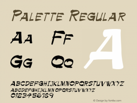
Sauna, a warm and friendly typeface from the Dutch type foundry Underware, was rejected in an alternative design direction proposal early in the redesign process, but found a home in the reader-favorite "Pot 40" column.

Source: http://robbricedesign.com.License: All Rights Reserved.

Source: http://robbricedesign.com.License: All Rights Reserved.
Source: http://robbricedesign.com.License: All Rights Reserved.

Source: http://robbricedesign.com.License: All Rights Reserved.


 闽公网安备35010202000240号