


Mota Italic Gallery Celebrates First Anniversary With Pre-TYPO Berlin Party


Last year after landing in Berlin Schönefeld the Wednesday evening before TYPO Berlin "Shift" I immediately made my way to the Schliemannstraße 34 in Prenzlauer Berg for the opening of the Mota Italic Gallery. The gallery exists to showcase type, letters, and typography in both art and design, and is owned and operated by type designer and University of Reading alumnus Rob Keller and type technician Sonja Keller. The husband-and-wife duo run the type design studio Mota Italic, specialising in unique, extensive type families. In a mere twelve months the gallery has carved out a name for itself in the Berlin design scene as the organiser of beautiful exhibitions – modest in size yet not in scope. Tomorrow night Wednesday, May 16th TYPO Berlin attendees are invited to celebrate its first anniversary as well as Europe's biggest and best recurring design conference at the +1 Year & TYPO Berlin Party. The party begins at 6pm and will go until late, and will be the perfect start for the big TYPO Berlin weekend. Make sure to get there early and enjoy drinks with the crème de la crème of the Berlin (type) design community and foreign guests.
An overview of the exhibitions of this past year:
Capital: Berliner Buchstaben


Capital: Berliner Buchstaben celebrated the diversity of Berlin's surprisingly large type community. Mota Italic paired the typefaces of 27 Berlin-based type designers with the work of 27 local illustrators/designers/artists. This relatively small collection featured the work of a wide variety of individuals – from life-long designers to recent graduates and from design "celebrities" to students. Most participants are employed full time as type/graphic designers or illustrators, but for some, their work represented was more of a passionate side project. Through these images, one could easily appreciate the diversity of the local design scene and get a taste of the current visual gestalt.
Was on display May 19th – July 22nd, 2011.
Type Masters


Type Masters gave a sneak peek at 24 new typefaces from the 2011 graduating master classes at the University of Reading (UK) and the Koninklijke Academie van Beeldende Kunsten (NL).
Was on display July 26 – September 08, 2011.
Photo-Lettering


Photo-Lettering had the audience marvel at the magnificent creations of House Industries' Photo-Lettering collection. These anal-retentively produced prints, by master screen printer David Dodde, were a true wonder to behold in person. 22 beautiful designs illustrated the pinnacle of what is possible when the right people combine fantastic letters, clever ideas, and luminous inks with the perfect paper. Limited quantities of the prints were also available for purchase.
Was on display October 4th – October 29th, 2011.
Blacklecker: Tasty Fraktur


Blacklecker: Tasty Fraktur comprised of 22 unique, modern typefaces that interpret the blackletter style in new and exciting ways. Through these designs, common stereotypes and connotations often associated with traditional blackletter types were severed, allowing this genre to advance with the times and serve new and interesting roles in contemporary design.
Was on display November 5th – December 23rd, 2011.
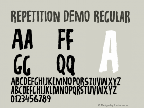
Rotation, Reflection, Repetition, Repetition.


Rotation, Reflection, Repetition, Repetition appropriately started off the year with some of the basic concepts of visual design. Using the foundational ideas of rotation, reflection, and repetition, students in the Visual Communications program at the Universität der Künste Berlin created beautiful patterns and textures using a selection of blackletter typefaces. The students were participants of Simone von Eldik's typography seminar (assisted by Tanja Kapahnke), inspired by Judith Schalansky's book Fraktur mon Amour. In contrast with the ever-present stereotype of blackletters as being symbols for Germanism and patriotism, a multitude of patterns emerged with surprisingly modern, contemporary aesthetics.
Was on display January 4th – 29th, 2012.
New Vintage Digital Vernacular Letters


Thanks to digital cameras, smart phones, nearly unlimited storage space, and online social sharing it is easier than ever to capture, collect, and share images. Particularly exciting is the now relatively mainstream pursuit of photographing interesting found type and lettering. Whether it is encountered in one's neighbourhood or stumbled upon while travelling, there is seemingly no end to unique letters to be collected. This phenomenon is illustrated through dozens of blogs dedicated to found letters, to Flickr's countless tagged images of type, and by sites like we love typography – currently with 12,000+ curated images.
New Vintage Digital Vernacular Letters was modestly comprised of just under 600 images* from 120 participants from all over the world. These photos depicted the letters as shiny and new, dilapidated and old, incredibly beautiful, incredibly ugly, mundane, idiosyncratic, everyday, unimaginable, local, and exotic. The images were shot in more than 40 countries and the variety of letter forms indicated just how special letters and typography can be.
Was on display February 1st – April 7th.
{It's a Font!}


The current exhibition {It's a Font!} showcases Mota Italic's latest type family "Gemma".
On display since April 24th.


 闽公网安备35010202000240号