


Finding the Best Quality Web Fonts

Not all fonts are created equal. Some are designed specifically for headline sizes while others are meticulously crafted for use at smaller sizes for reading paragraphs of text. So when building websites, what is the best way to find fonts to meet your particular needs?
At Fonts.com, we're pleased to provide new tools to let you discover fonts based on their on-screen quality attributes and usage. "Web Font Quality" and "Recommended Use" are two new classifications available to you as part of a font search.
WEB FONT QUALITY
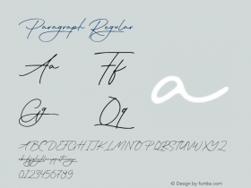
The first thing to understand is that fonts are rendered differently across operating systems (Mac OS X, Windows, Android, etc.) and across versions of browsers (IE, Firefox, Chrome, Safari).

The above illustration shows that fonts can look different across browsers and operating systems.
As a Web designer, it's important to proof your work in different browsers and platforms, to ensure the fonts you select will meet your quality needs. We have created two categories to designate the quality of Fonts.com Web fonts:
Screen OptimizedHand Tuned
"Screen Optimized"fonts are those that have been processed by Monotype Imaging's font development team through a set of proprietary tools to 'hint' the fonts for optimal rendering in Windows browsers. Windows uses two common methods of rendering fonts: ClearType and ClearType with DirectWrite. Both of these use special 'hints' programmed into the font to adjust the pixels used to display fonts. Our propriety hinting tools allow us to generate enhanced quality Web fonts that can be superior to the standard tools commonly used by type designers.
"Hand Tuned"fonts represent the crème de la crème of Web fonts. Our font experts manually program each of these fonts to improve their display on screen, especially at small sizes. We spend hours on each font, hand tuning their appearance by focusing on the finer details of each character in a font. Hand Tuned Web fonts will have a level of quality that is expected of fonts used at small text sizes.

For each Web font, we provide a variety of 'browser shots' that captures how a particular font looks in various systems and browsers.
RECOMMENDED USE
Another new sort classification is "Recommended Use." We have created this to help you select fonts that will work best in these general size settings:
ParagraphHeadline
"Paragraph"fonts can be confidently used at sizes from 12 to 24 pixels on screen. Paragraph fonts typically have a family with multiple weights and styles available. For example, regular, italic, bold and bold italic. Many families include weights like light and medium as well. Paragraph fonts all feature Hand Tuned Web font quality and have been tested for use at reading sizes on screen.
"Headline"fonts are for use at 24, 36, 48 pixels and higher. These are fonts that are best used at the larger sizes associated with headlines and include script and display font styles. Headline fonts also have extreme weights including ultra light and heavy or black. Care should be taken when using Headline fonts at smaller sizes than the recommended minimum.
The new Fonts.com includes great features for searching and discovering fonts, especially our high quality Web fonts!

In the search window, you can refine your search by adding additional criteria. In the above example, we have added "Web Font Quality" to refine the search, and you can instantly see the result of fonts that are Hand Tuned and Screen Optimized.
We hope you enjoy these new features on Fonts.com to discover the best quality Web fonts available for you to use in your next project.


 闽公网安备35010202000240号