


Customer Spotlight: Intel

Founded in 1968, Intel has been at the forefront of technology development for over 40 years. The company brought the first microprocessor to market in 1971, and continues to be a leader in computing technologies today.
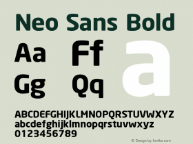
The Intel website features a customized version the Neo Sans typeface family exclusively, employing light, regular, and medium weights. While a typeface sharing the DNA of both a square and geometric sans might, at first blush, seem detrimental to readability, the use of multiple weights stages a dynamic and pleasant visual hierarchy.
In terms of the aesthetics of the letterforms, Sebastian Lester—who designed the Neo Sans family in 2004—characterizes the typeface as "legible without being neutral, nuanced without being fussy and expressive without being distracting."
You can certainly appreciate that sentiment while browsing through the many layers of Intel's website; the Neo Sans typeface family provides subtle cues of the ever-forward mission of the company without seeming like visual hyperbole.
Featuring a robust selection, also including bold, black, and ultra weights, Neo Sans is available in 24 varieties through the Fonts.com Web Fonts service.


 闽公网安备35010202000240号