


Caméra Stylo, Festival de Cinéma


Do you know what an LTypI is? If you are a type nerd, then the answer is probably yes. Coined by Stephen Coles, the term denotes and ridicules those typographic finds where the text reads the same as the name of the typeface it is rendered in. The brand name is Cooper? Let's do
Ben Mitchell found a perfect LTypI in Brighton, starring Ed Benguiat's ITC Souvenir.
A takeoff on "ATypI", LTypI stands for "Lack of Typographic Imagination", as it seems that the designers — if you want to call them that — couldn't be bothered with selecting an appropriate typeface, but rather lazily picked one from their font menu solely because of its name. Over on Flickr, almost one hundred LTypI examples have been collected so far. Some of them are outrageous (Rotisserie in Rotis Serif), some more subtle (Goudy for Gaudí).
And then there are a few that don't really deserve that snide name. Frutiger's doorbell is set in Frutiger — well, what else? Probably the most beautiful example of such an alleged LTypI comes from the Argentinian designer Juan Ignacio Scocozza.

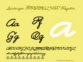
Two posters advertise the "Ciclo Nouvelle Vague" (50×70 cm)
Scocozza created the visual identity for a film festival that deals with the Caméra Stylo (the pen camera), an idea that is central to the auteur theory of the French New Wave, or Nouvelle Vague. There, the role of the director was considered to be the one of a writer, and the camera to be his pen. What could be more adequate than an idiosyncratic script typeface? And, on top of that, one that is inspired by 1950s France?


The festival's logo resembles an old film reel.
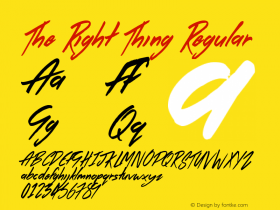
Scocozza searched hard, and found a perfect face: a fresh release by Elena Albertoni, less obvious than good old Mistral, "energetic, loose, occasionally edgy, and with quite a soupçon of retro", as Indra Kupferschmid put it in her review. Its name?Nouvelle Vague. While this choice technically qualifies as LTypI, it is not unimaginative at all. Ruling out a typeface because of its name is as wrong as choosing it for that reason. With his work for the "Festival de Cinéma Caméra Stylo", Scocozza proves that a conscious, nominal LTypI sometimes is just the right thing to do.

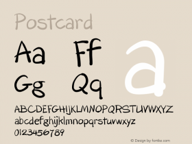
The three program leaflets contain the daily schedule, a synopsis of the screened film, and a biography of the director.
The printed matter is comprised of posters, program leaflets, and postcards. All items are visually united by a graphic style that, like the typeface, epitomizes a cinematic French retro feeling:
For the color palette, I mostly used red, white and blue, like in the French Tricolore. The desaturated tones contribute to the desired vintage atmosphere. Objects, faces, bodies, and landscapes are depicted in a graphical language that is mostly linear, simulating the use of a fountain pen and the artist's own freehand, with the ink and its splashes being vital elements of the visual identity. — Juan Ignacio Scocozza


The postcards depict iconic scenes from the movies (15×10 cm).


 闽公网安备35010202000240号