The Typography of Dexter, Serial Cover Star
Another thing I saw strolling down the streets of San Francisco with my friend Obama posters I had been seeing, and indeed – it is a design by the same Shepard Fairey, better known under his nom de plume Obey Giant.
Shepard Fairey does Dexter © Joe Pemberton
Joe Pemberton comments, "Notice the re-use of Fairey's own Obama pose there. I've been interested to read how this trend is emerging in propaganda posters. The upward stare, the aspirational 3/4 view, etc.".
The advertisement is of course for Dexter, the hit television series from Showtime my wife and I immensely enjoy watching. As usual Europe is behind on the original broadcast, which means we're only two thirds into the first season. There's just this thing about a blood splatter analyst with the police department who secretly is a likeable serial killer – it's a bit disturbing that one can sympathize with such an immoral lead character.
The inventiveness of the promotion is up to par with the overall quality of the series. The most striking part of the recent campaign is a slew of print advertisements made to look like mock covers of popular magazines. It was created by Red Group, an internal creative unit at Showtime, and the Initiative unit of the Interpublic Group of Companies, the Showtime media agency. Last month the campaign was taken up a notch when the covers were extended into mock magazines with a limited page count. Those were distributed in news stands specially erected for that purpose; one of them for example on Union Square in San Francisco (I'm really sorry I missed that).
The spoof magazine covers are incredibly well crafted and look very convincing. Faithfully recreating the magazine logos and finding the correct typefaces for the cover titles must have been a difficult task, yet most of the covers make you look twice before you realize that the logo actually spells out "Dexter" instead of the magazine's original name. They are a real treat to discover and very funny, especially with the "slasher" references in the titles and some of the cover images. The fact that the choice of cover type sometimes is a bit off doesn't diminish the fun. I wonder if the Typophile Type Identification Board was consulted for this job.
Read about the Emmy Award-winning opening credits of Dexter on Unzipped.
The first four covers below were made available as desktop images on the Dexter website – hence the better quality – while I found the remaining ones in a number of galleries on the internet.
The Wired cover of course presented a considerable problem. While indeed it once used to feature Foundry Gridnik – the faceted sans seen on the mock cover – last year the redesign introduced the custom typefaces Vitesse and Vitesse Sans, a squarish slab serif and sans by Hoefler & Frere-Jones. "Custom" of course means not available to the general public, hence the problem. They got the magazine logo right, but I'm not sure either Stymie Extra Bold (it's in FontBook but I can't seem to find the exact weight on FontShop.com) or Cholla Sans ever made the cover of Wired. Minor point of criticism – to remain consistent with the Wired look Michael C. Hall's head should have partially covered the magazine logo.
And it looks like the GQ cover is behind the times as well. Although the same Foundry Gridnik is still used on the British website it seems to have been abandoned in favour of David Berlow's Titling Gothic (and at least in one instance Sebastian Lester's Soho – August's Victoria's Secret Models cover). The logo is spot-on though.
Again a very realistic magazine logo for the Vanity Fair cover. The original typeface is Terminal Design's custom VF Sans Condensed, an interpretation of the classic metal face Vogue. You can approximate its look with Neutraface No. 2, or Nobel if you prefer a more "vintage" palate. James Montalbano also created VF Sans and VF Script for the magazine, and cover titles are usually set in VF Didot, a slightly condensed Didot. The mock cover uses light Helvetica caps which may not be accurate but kind of fits.
The Details cover uses all caps ITC Conduit and Digital Sans for the cover titles. The feel of these tech-like sans faces is a decent approximation of Hubert Jocham's September in the original, considering this once again is a custom typeface not available to the general public. Similar B and R shapes can also be found in Psy/Ops' Sophisto or Jocham's own NewJune.
The rest of the spoof covers were found in a number of online galleries.
A mix of Interstate and Helvetica was used for the US Weekly cover. I can understand Interstate can be mistaken for the magazine logo and big title, but Helvetica looks completely out of place. The original covers feature different weights and widths of Relay, Cyrus Highsmith's versatile interpretation of C.H. Griffith and W.A. Dwiggins' Art Deco geometric sans designs. The only thing that bugs me is the ampersand that doesn't match.
Matching The New Yorker was easier as the typeface based on its logo was named after the magazine. Irvin, the original header type for The New Yorker was designed in 1925 by Rea Irvin, first art director of the magazine. Keeping in tune with the illustrative covers Edward Sorel – an artist who often draws covers for The New Yorker – was commissioned to do a portrait of Michael C. Hall as Dexter.
The New York Times Magazine cover shouldn't have been too hard neither. True, the nameplate is custom designed but a good number of Old English-style blackletter faces come reasonably close to be adapted. And the cover type is spot on – Stymie Extra Bold (which can be found in FontBook but seems to be missing on FontShop.com).
The last four cover logos must've been quite difficult to "forge". Los Angeles Magazine's script is not unlike Alejandro Paul's Mousse Script or Milk Script, but obviously had to be recreated from scratch. The cover titles on the original covers are set in Gareth Hague's Anomoly and Zuzana Licko's Fairplex. On the mock cover the latter was replaced by Serifa-like Boton by Albert Boton, an understandable substitution.
:: U P D A T E ::Typophile Michael Albright revealed that – although it is not featured in his gallery; I checked because I had a hunch – Jim Parkinson is also the author of Los Angeles magazine logo.
Some more Boton on the Esquire cover, this time paired with Stymie Extra Bold Condensed (this one is in FontBook as well but not on FontShop.com). It is very faithful to the type laden original covers. The typographic backgrounds seem to alternate between a similar very bold slab serif, Hoefler & Frere-Jones' Mercury Display (see also Christian Schwartz's Farnham Display) and hand lettering. As for the original logo, it is a classic, revived by nameplatemeister Jim Parkinson. On a side note – this year marks the 75th anniversary of Esquire. You can see its covers evolve over the decades in the Esquire Cover Gallery.
Another Jim Parkinson design is the logo (simplified version) for Rolling Stone. As you can read on the Rolling Stone website "Rick Griffin, a surfer-illustrator-cartoonist famous for his posters around the San Francisco scene, designed the original. In April 1976, Roger Black, a typographer by training, took over as art director, and our tenth-anniversary cover, in December 1977, marked the end of the hand-drawn version and the initiation of a bolder, smoothed-out typeface. Five years later, at the behest of Mick Jagger – who told me late one night that "you've made it too clean" – we added back some elements from the original to create the iconic logo that graces our cover to this day."
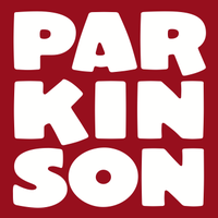
The entire mock cover is a Parkinson affair, because the titles are set in his eponymous Parkinson family of faces. I have the impression that on recent covers Parkinson is being ousted by Cochin, unless this is a temporary thing. But all in all this is again a very successful imitation.
And last but not least there's the Interview cover whose characteristic brush logo obviously had to be redone by hand as well. The type seems to change quite a bit, so I guess picking Alternate Gothic was fair game, although I've not seen FF DIN on any of the original covers. They might as well have stuck with Helvetica Black.
To conclude I must say that this has been a terrific and humorous campaign, and the odd typographic misfires shouldn't detract from the fact that this is top notch work; very successful throughout the whole series of covers. And maybe next time they can ask us in order to get even the most minute typographic details right. ;)








 闽公网安备35010202000240号