


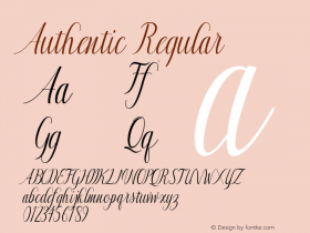
Post-Halloween Special: Scary Type


Yeah yeah, I know what you're all thinking. "Oh no, just what we need – one more collection of lame "fun" fonts celebrating some crass over-commercialized holiday". And, actually, I agree with you. Halloween fonts? Christmas fonts? Hanukkah fonts? Easter fonts? I cringe every time they get thrown our way at yet another festive occasion. Why? Because those inane compilations never seem to rise above the anecdotal nor the juvenile. Because you can be sure to have a couple of complete duds amongst them. Because they lower our perception of the artistic value of type by offering silly fonts at a ridiculously low price. Basically they are condescending; an insult to our artistic taste and our intelligence.
Plus I have this dubious relationship with Halloween itself, at least in the Low Countries. The tradition never existed here in the first place, and it was imported only recently by commerce. Actively looking to fill up every single downtime between the other holidays, shops are trying everything to keep us consuming all year long. This new Halloween thing is superfluous as well: our local celebrations have all the bases covered. Dressing up? We have carnaval in February. Candy for the children? Sinterklaas brings it every 6th of December. Going from door to door at night? Children do that to collect pocket change on January 6 for Drie Koningen.
Still I do write for an international blog so I wondered if I could do something with the concept of fear in typography. I'm convinced that certain type designs – and in particular display type – can convey a specific feeling, a certain atmosphere, as most typefaces have their own discernable voice. While some shout it out, others do it a little more cunningly. Of course a lot depends on context, but still… So this Halloween I started compiling a list of "scary" fonts. Somehow I became so engrossed by my research that it took far longer than I expected to write and document this post. I still hope it is of some use to someone. And I always say – better 51 weeks early than one week late!
By the way, this is not the definitive list by far, and a very subjective one to boot. Please feel free to offer suggestions so we can add to it and flesh it out. This should be fun.
I reckon I expose myself to possible ridicule from serious type designers and users, but I felt that – after the Queen Raquela misunderstanding/debacle – I didn't have any credibility to lose anymore. And frankly, do I look like I even remotely care? ;)
Dog Barking © Pat
On a basic animalistic level we're scared of anything that could bite us or shred our skin, flaying the living flesh from our bones and feasting on our entrails. So any shape that reminds us of predators – be it real animals or imaginary creatures like vampires or werewolves – is potentially scary. No, I don't mean MON.ster. The typefaces below all have features that hint at claws, fangs and other sharp and lethal attributes.
Originally developed as a logo for Imperial Recordings, a Dutch techno/trance record label,FF Imperialwas ultimately rejected for being too "goth". Donald Beekman gave the two variants rather sinister names. Spike has almost vampire-like pointed stems, and the rounded version gives the characters of Bone a bone-like quality.
Richard Lipton developed designs by Los Angeles graphic designer Margo Chase, recognized worldwide for her skill with custom typography and identity development, into digital typefaces.Talonspells it out quite literally. Its characters reference the sharp claws of birds of prey.
Shogunis based on a few almost oriental characters from a striking contemporary logotype by Chase. The sharpness remains, but as the characters are broader they look more like hatchets or cleavers.
AndEcruis based on four unique capitals E, C, R and U. It is composed of sharp spikes that look ready to impale you.
I don't know inhowfar Adam Roe'sPercolatorwas inspired by Miles Newlyn's seminal Democratica which preceded it by two years, but the sharp finials add a level of danger to Roe's interpretation.
Not exactly claws or fangs, but frightening spikes adornJesusLovesYouAll. This is one of the remixes Luc(as) de Groot made of TheSans, the sans variant of his breakthrough type superfamily Thesis.
Sunset on Irish Grave © Brian Lary
The western culture has always had an uneasy relationship with the dead, unlike many other cultures. This is probably why cemeteries spook us. Tombs, mausoleums and necropolises turn into eerie harbingers of doom at night. We imagine them being haunted by the souls of the departed, vengeful ghosts that torment us and drag us down to the netherworld. The fonts in this section remind us of the carved lettering and other typical shapes on headstones, with some immaterial characters thrown in the mix.
Jonathan Barnbrook works in the twilight zone between art and graphic design. Not content with merely designing typefaces, he constantly researches context and semantics. Some of his alphabet designs are strongly influenced by gothic architecture and letters carved in stone. These typefaces seem to have struck a nerve with graphic designers and art directors, because they often appear on items related to horror movies and games, goth and metal albums and book covers, even on the DVD cover for Snow White and The Seven Dwarfs, The Scariest Of Them All.
Exocetis based on study and redrawing of early Greek and Roman stone carved letterforms which have been reinterpreted to give a very contemporary feel.
Mason Serifis based on drawings made in Barnbrook's sketchbooks over a number of years with added inspiration from 19th century Russian letterforms, Greek architecture and Renaissance bibles. Every character comes in at least two variant shapes; and those are all available as capitals, regular small caps and superscript small caps. It even has gothic arches for A's and crosses for T's.
Echoing much of the "English" lettering that first inspired Barnbrook to start drawing typefaces,Priori Seriftakes from many of the lettering experiments in the 20th century. Lately I saw it used in the introductory text for Hellboy II: The Golden Army.
The report of John Barnbrook's presentation Type Is Image at Typo Berlin 2008 on Unzipped.
The ethereal letter forms ofCharter Dby Patrick Adamove seem to lack any substance, ectoplasmic entities drifting away on the slightest chilly breeze.
Peter Kowaleszyn'sPoltergeistandStaticare quite aptly named. Their character shapes become immaterial, like ghost-like forms barely discernible in the static on a television screen.
Skull & Crossbones © Benjamin Earwicker
As we are obsessed with youth and vitality growing old and the prospect of dying frightens most of us. Just the thought of our decaying body becoming dependent, growing sick or being afflicted by dementia is unbearable. Even worse is the concept of the dead being revived, grotesque simulacra composed of rotting flesh and seeping innards with an uncontrollable urge to crack open your skull and slobber up your brain. The fonts in the list below are in a certain state of decomposition.
Thanks to the grunge boom in the nineties there are countless degraded typefaces out there, so I won't list them all. Yet there are a couple worth mentioning. The LetTerRor collection FF Instant Types dates the beginning of this movement and became insanely successful – just like most of the Erik van Blokland/Just van Rossum productions. Many find the degradation found inFF Confidential and FF Stampgives them an air of creepiness, as they are commonly used for thriller and horror designs.
As 2Rebels was founded during the grunge boom it carries a quite few worn typefaces. Yet I have moved most of them to the next category as they display a level of restlessness which reminds me of paranoia and insanity. One that really looks aged isBad Deniby foundry owner Denis Dulude, as doesK.O. Dirty.
The characters of bothFF MutilatedandFF InnerCityfrom the FF DirtyFaces collection have been eroded by the elements.
My generation grew up during the Cold War with the possibility of a nuclear holocaust hovering over our heads. Nowadays it's terrorism – be it fundamentalism or government-sponsored – that forces many to live in constant fear. The following typefaces look like they were blasted to bits, burned to a crisp or melted down.
Just van Rossum's FF Advert – a humanist take on W.A. Dwiggins' Metro – is one of those notoriously under-appreciated FontFonts. The five weights of theFF Advert Roughvariant of can be overlayed to form outlined type. Yet most interesting things happen when you slightly shift and/or rotate the stacked weights.
According to designer John Critchley,FF Bullis an authentic reproduction of old John Bull rubber stamp type sets, inked to varying degrees to produce six distinctive "weights". Just like FF Advert Rough these are fully interchangeable and can be combined or overlaid to provide even more variations. The look of the UnderInked, SemiInked, Outline and Double weights make it fit into the Disasters categoy, not in Death & Decay.
Agreed,Adolescencelooks like Neville Brody's classic FF Blur with a little FF Autotrace flavour, but by adding unexpected variations in weight and size Adam Roe added a feeling of uneasiness which makes it fit in this list.
The FF DirtyFaces collection also includes some designs that seem to have been afflicted by disaster. BothFF MotiveandFF NineSixNilNillook as if they're caught in an explosion.
And Jay David'sDanghas bits and pieces flying off too.
There never was a more convincing typographic metaphor for nuclear meltdown than Tobias Frere-Jones' Fuse excursionFB Reactor.
Beneath the surface © Dave Sackville
But perhaps what frightens us the most are paranoia and madness, lurking just beneath the surface in a familiar and seemingly normal person. Imagine the veil of sanity unexpectedly being lifted, revealing a psychopath who attacks without warning. The postman brutally entering your home, tying you up and starting to torture you with pliers, drill and power-saw. Your own dear grandmother suddenly turning around, bloodshot eyes wide open, foam at the mouth and brandishing a big carving knife. This feeling is perhaps the most difficult to convey in typography, but I think the examples below come mighty close.
As I mentioned above, many of the worn typefaces in the 2Rebels collection have a fractured, unhinged look. This is why I prefer to fileCarbon,DV9, andHanbuhrsin the Paranoia category.
And bothFF DirtyFaxandFF Angstalmost literally portray the damaged psyche too.
By duplicating the character shapes, shifting them horizontally and using the cross-section of each set of characters Jan Tomás createdAlphabat. The end result looks frenzied and restless.
Just as frenzied and restless isMotionby Frank Heine which emulates the compulsive obsessive scribbles of a psychopath.
Matt Heximer'sBitchin Camerois in the same vein but with more variation in the lines that compose the letters.
If I were asked to pick one really scary face, I guessGrassywould be the one. Do you know the scenes in those fifties thrillers, where the female lead finally snaps under the psychological torture and dashes out in the night, running through the moonlit willows? This creepy creation by Inka Strotmann perfectly captures that atmosphere.
Header image:Halloween Pumpkin ©2008 Crystal WoroniukHeader type:FF Mutilated, FF Imperial Bone, FF Sanuk BoldAll samples (except FF Advert Rough) set with the standard font previewer on FontShop.com.All sample text are titles of The Simpsons Treehouse of Horror episodes


 闽公网安备35010202000240号