


OS X 10.8 (Mountain Lion) Notes App


Photo: Stephen Coles. License: CC BY-SA. Artwork by Stephen Coles.
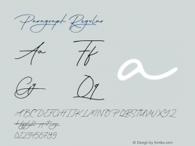
You're looking at Noteworthy, an Apple typeface that has been around on OS X for about a year (since Lion 10.7), but was unknown to most users unless they stumbled on it in their font menu. It is the default font for the new Notes app in OS X 10.8 (Mountain Lion). It's a fun little retro ditty, but this choice is arguably worse than the notorious Marker Felt, used for the first versions of Notes in iOS and almost universally mocked. Its very tight letterspacing and playful shapes make it even less readable and legible than Marker Felt.
Fortunately, unlike the hacks that were required of iOS users who wanted to free themselves of Marker Felt, the Notes app does allow you to engage the Fonts panel and use any font you wish. But it's another disappointing default choice from Apple.
Also, Notes wants to automatically align everything to the lines in the skeuomorphic background. Cute, but it doesn't do a great job deciding when to jump the type to two lines. See how the change in font in the first paragraph confuses the automated linespacing.
There is no designer credited in Noteworthy's font copyright info, but the vendor field is assigned to Apple. The design is based on a Filmotype face called Alice/Brooklyn, though the original source could be any of many very similar fonts from the early phototypesetting era (1950s–'60s). There is a bold but no italics.


 闽公网安备35010202000240号