


ScreenFonts: Moonrise Kingdom, Rock of Ages, Abraham Lincoln: Vampire Hunter, Magic Mike


Last week I took my children on a last-minute visit to Paris (three hours away by car) to see the Tim Burton exhibition at La Cinémathèque française. Although typography barely played a role, it was interesting to see how Burton's drawing style and handwriting clearly influenced the lettering/type on certain posters for his films like Corpse Bride, The Nightmare Before Christmas, Alice in Wonderland, and Big Fish. Other directors religiously stick to specific typefaces and become inseparable, like Woody Allen and Windsor, or Stanley Kubrick and Futura Extra Bold. So it is all the more remarkable when such a strong connection gets severed.
This is why we open this episode of ScreenFonts with a dramatic typographic departure for Wes Anderson, who abandoned Futura on both the poster and the opening and closing title credit sequences for Moonrise Kingdom. The jury is still out whether David Wasco, Anderson's production designer on The Royal Tenenbaums, turned him on to Futura, or if it was Anderson's tribute to the aforementioned Stanley Kubrick who favoured the Extra Bold weight. Whatever may be the case, the custom-designed copperplate script by Jessica Hische could not be any further removed from the extra bold geometric sans. Jessica's collaboration with Anderson was part of her presentations at TYPO San Francisco and Berlin last Spring; you can read more about it on her website. It is quite unusual that the movie title face also gets used for the actors' names and even down to the credits, usually the exclusive domain of Univers 49 Light Ultra Condensed or Bee.
The stunning hyperrealistic painting used for the poster is by Michael Gaskell, a British artist whose "aim is to produce paintings of heightened realism which convey a sense of stillness and contemplation." As Gaskell explains on his website, the hallmarks of his work are clarity of composition which engages the eye in combination with a high level of detail rewarding close scrutiny.
The little girl wearing a gas mask at the end of a tunnel makes the teaser poster for horror thriller Chernobyl Diaries extra sinister. The combination of the high contrast image on dirty off-white with the suggestion of bloody smears makes for a gritty textured image. This grittiness is sustained in the letter forms of Revolution Gothic. This square sans serif is "inspired by retro propaganda posters and wall paintings in Cuba from the 60s to the 80s." It is a good fit for the poster, both formally and conceptually, as the blocky character shapes are reminiscent of the constructivist poster art also found in the former Soviet Union.
It sometimes happens that there is a typographic inconsistency between the teaser poster and the main poster, which is murder for an obsessive-compulsive person like me. Though both typefaces are very similar, the "S" has a diagonal spine, not a horizontal one. Close, but no cigar. : )
Then there's the whole debate about using faux Cyrillic – or any faux non-Latin type design for that matter. For people who don't read Cyrillic, the stencil display sans with the occasional "cyrillified" character reinforces the idea that the film is set in Russia or any of the other countries using the Cyrillic alphabet. However I learned from Ivo Gabrowitsch, marketing manager at FontFont, that when you do know the alphabet, you can't help but misread the type on this teaser poster. Do or don't? I fear we're not even close to a consensus.
I am always so happy when designers use alternatives to overused typefaces that I have to point them out. On the movie poster for For Greater Glory the conspicuous Trajan was shunned in favour of Shango (which frankly has one of the most bizarrely proportioned capital Ys I know of). The supporting typeface is the vintage-looking Cantoria, Ron Carpenter's 1986 revival of ATF's 1902 release Della Robbia, designed by Thomas Maitland Cleland.
Bel Ami does something really interesting with the tired old concept of the ensemble cast/floating heads on its movie poster. The width of the poster is divided in four equal parts, yet the photographs have a certain way of either adhering to these divisions or ignoring them. This results in a novel image where Robert Pattinson crosses over the four parts, but the three actresses behind him are restricted to their image area. Because they all wear clothes in distinctive colours the effect is quite striking, also due to the contemporary looking rounded corners at which are unusual for posters for period movies. Add to that a title set in the geometric sans serif Metro/Geometric 415 and you get a convincing poster that breaks the mould.
Check the conventional design for contrast, which uses Ballantines Script.
Sometimes film poster design doesn't need to be rocket science, as shows the movie poster for Rock of Ages. This typical style of bevelled pseudo-gothic lettering can be traced all the way back to iconic graphic designer Gerard Huerta's album cover for Blue Öyster Cult's On Your Feet or On Your Knees and his subsequent logo design for AC/DC.
We switch music styles, and frankly I didn't expect this. Ice-T's documentary Something from Nothing: The Art of Rap forsakes bling and swagger on its movie poster, instead using type exclusively. The visual style reminds me of Lou Dorfsman's legendary Gastrotypographicalassemblage — the massive wall of hand-milled type set in a 35 foot long by 8 foot high California job case for the CBS cafeteria.
Gastrotypographicalassemblage from Kemistry on Vimeo.
The typefaces in the poster are a somewhat uneasy mix of old and (relatively new) – apart from the red Gotham I detect the almost forgotten Emigre classics Platelet and Lunatix next to Microgramma/Eurostile Extended and Rockwell amongst other. I think the result would have been better with either more unique typefaces, or typefaces that are more identifiable with rap music, or one single super family in a gazillion weights and widths. I like the effort they made, but find the execution a bit lacking.

It sometimes pays to take a look at non-mainstream, non-American movies for fresh poster designs (although those can also be quite terrible at times). A nice example is Patang (The Kite) which sports a joyous, colourful painting, perfectly visualising the tagline "Hold on to your happiness". The bright colours of the kite are repeated as broad brush strokes symbolising fighter kites flying past behind the two actors, and can also be found in the film title set in News Gothic.

This alternate design treats the kite-themed visual a little differently. It focuses on the bandaged fingers holding the fighter kite's line, wounded by the coating consisting of a mixture of finely crushed glass and rice glue. The semi-transparent colours of the kite are overlaid over the city and a portrait of one of the movie's actors. Instead of using a faux-indic script the original title set in a simple "sans serif" style was added, nicely complementing the Latin version.

From a little closer – at least to where I am – comes the poster for French drama Americano. The design adopts a structure of horizontal bands, usually the reserve of romantic comedies, to tell a narrative in one single poster. This overused style is given a nice twist through the absence of white, the saturated colours and some wonderful lettering.

The credits were written by hand, and beautifully knocked out of the intense blue and black. The rich red of the neon lettering nicely contrasts with these cold hues; I like that the movie title is a genuine sign, not a typeface. I would describe the idiosyncratic style of the sign as Victorian meets fifties. If anything the mistakes in the proportions of the letters actually add to its charm – the 'm' and 'n' are too narrow, and the 'r' is far too wide, but somehow it all gels and works very well.
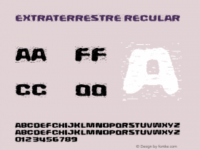
The poster on the left for Spanish sci-fi comedy Extraterrestre (Extraterrestrial) is nothing exceptional. The main protagonists look at the viewer with a spaceship hovering over the city behind them; the movie title is set in FF DIN Condensed. The typographic version on the right reminds me a little of the similar design for The Departed for its use of Aachen set large, yet this application is far less adventurous. The version that immediately caught my eye however is…

… this delicious Space Invaders-themed variant that revels in its pop-culture nerdism. The execution is picture-perfect, down to the dot matrix face used for all the text. And it's all in the details – the two cups of coffee for lives in the lower left corner, and the little heart in lieu of a bomb above the only house with lit windows. Lovely!
'Abraham Lincoln-Vampire Hunter' Movie Trailer from redCola Music on Vimeo.
Back to the USA – if anyone had told me they were making a movie depicting the sixteenth President of the United States Abraham Lincoln as a friggin' vampire hunter I would have never believed it. And yet, here we are witnessing the pinnacle of movie-making bad-assery – the quite literally titled Abraham Lincoln: Vampire Hunter. The movie collaterals and trailer were included in Carima El-Behairy's presentation at TYPO Berlin 2012 "Sustain", as they prominently feature P22's best-selling P22 Cézanne. The bracketed slab serif underneath is the inescapable Clarendon, the unofficial official typeface of that other period action movie Sherlock Holmes and its sequel Sherlock Holmes: A Game of Shadows.
I already mentioned Woody Allen in the introduction, and lo and behold, here is the poster for his latest film To Rome with Love, featuring his trademark typeface Windsor. Upon a recommendation from Ed Benguiat Allen has been religiously using Windsor for his credit title sequences for over 25 years. However the typeface only started appearing on his movie posters comparatively recently. With a simple lipstick kiss and a postal stamp for Rome as only graphic elements, the design of the poster is a throwback to the high-concept/simple-design style of 70s advertising. This makes the list of actors and the movie title set in the distinctive typeface a crucial element in the branding of the film.
After having seen one too many faked small caps on movie posters using Trajan, Adobe had – amongst many other improvements – proper small caps designed and included when their seminal Adobe Classic was upgraded to OpenType Pro in 1999. Yet there are still many designers for movie collaterals that commit this typographic sin with other classic serif capitals. So it is nice seeing somebody did go the extra mile to try to get it right. On the movie poster for the documentary Kumaré the initial K of Cochin Bold was not simply blown up. By the looks of it the designer enlarged the K of the lighter Regular weight until the width of the stems corresponded with the Bold weight. Then some parts of the letter were lengthened a little more, as was the leg on the R. It shows an attention to typographic detail that is sometimes lacking in even high-budget productions.
Just like Rock of Ages earlier on, Magic Mike merely shows the main selling point of the movie on its poster: in this case hot, half-naked actors showing off their ripped torsos. The Village People/Chippendales factor gets cranked all the way up by the giant Braggadocio letters suggesting a stylized stage and backdrop, with a spotlight against an intense blue background framed by the stencil character shapes. I guess it's time to party… ; )


 闽公网安备35010202000240号