


Martin Wait: Designer Of Typefaces With Charm And Grace

Martin Wait suffered from Dyslexia. He once wrote, "Although I can read, the words do not go in." One might think that a type designer that has difficulty with words would also have difficulty designing typefaces. While this was clearly not the case with Martin, sadly we will not see new designs from this proficient and prolific designer. Martin Wait passed away on August 5th.
 Because reading and spelling were very difficult for Martin, he struggled in school. While he excelled in many classes – including art – he performed dismally in English and classes that required reading. Dyslexia was not a recognized problem when he began his education in the 1950s. If a student struggled with reading, there was little additional help available. Secondary school was even more difficult, and Martin barely graduated. His art teacher, however, suggested that he attend art school. Later Martin wrote, "When the metal work teacher heard about this, he wanted me to go to a metal work school. My dad was a metal worker and he struggled to make a living. This influenced my decision to try art. At my interview the teachers liked my work, but when they saw my English results they seemed lost for words. Fortunately my English grades did not stand in the way, and I was accepted."
 The school was Lister Technical College – and Martin flourished. His first job out of college was for an ex Lister graduate. "His name was Ken Houghton," Martin wrote. "He wanted to train me in lettering and illustration. As time went by, it became clear that lettering was going to be the way ahead for me. Ken gave me a good start in a career that would earn me a living throughout my working life."
Martin went on to work at other design and lettering studios – mostly as a freelance designer – and eventually found a home working for Letraset. It is through the Letraset's dry-transfer lettering sheets, and later fonts that ITC released, that Martin's alphabets became commercial typefaces.

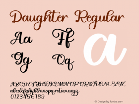
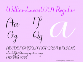
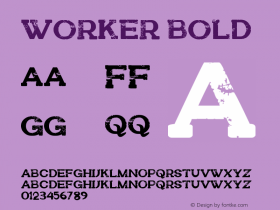
Martin's designs are intended for display applications, and range from the lighthearted and frisky Artiste, to the quietly elegant Balmoral. Recently, Martin had been designing typefaces for Monotype Imaging. The Julietrose family – named after his first granddaughter – is the first of these designs. WilliamLucas, named for his grandson, followed. Wellington, a much more stately design, finished shortly before Martin's death, will be released later this year.
Martin may have struggled with words – but he excelled in giving us the tools to set them with charm, grace and beauty.
Click here to learn more about Martin Wait and his typeface designs.

Allan Haley is Director of Words & Letters at Monotype Imaging. Here he is responsible for strategic planning and creative implementation of just about everything related to typeface designs.


 闽公网安备35010202000240号