


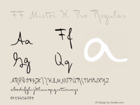
FF Mister K: Franz Kafka's Pen


Since last month – Jürgen already mentioned this – I can practise my passion for type as marketing manager of the FontFont library. It is self-evident that I will primarily deal with new developments. However the upcoming FontFont release proves that this does not exclude the publication of articles with a historical background.
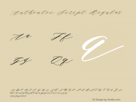
The manuscripts of author Franz Kafka had such a profound impact on Finnish graphic and type designer Julia Sysmäläinen that she decided to convert his handwriting with its unusually strong calligraphic characteristics into a digital script. The philologist took on the challenge to transform in Kafka's rather eccentric letter forms into an balanced typographic flow. This meant not only creating hundreds of ligatures – each of them consisting of two, three or even four single characters – but also integrating numerous alternate characters to avoid successions of repeating shapes, in order to lend FF Mister K Pro a more authentic script feel. Furthermore handy OpenType functions were added, for example for stylistic alternatives including hatched text as well as underlining and crossing out.

Eventually three completely different single fonts were developed. Besides the normal cut there's also Crossout, which allows for setting extensively crossed out text and Onstage, which clearly looks more extravagant and wriggly. All foreign languages and features included the standard cut alone contains more than 1,500 glyphs.
Graphic designer Oili Kokkonen, also originating from Finland, proves that one can compose very witty illustrations with the FF Mister K Pro characters. Pictograms for toilets, Sahti Institute of Design.
FF Mister K Pro is the only completely new design in the upcoming FontFont release 47, and will soon be available from FontShop (tentative release date December 1st). Meanwhile, to attenuate the waiting a downloadable PDF has been made available to anyone interested.
Update: Dec. 17, 2008 —FF Mister K is now online for sampling and download. It's available in either a Standard OpenType or a Pro version with additional language support. FontShop.com's advanced character set viewer reveals all the font's 1500 glyphs, including the hundreds of ligatures, stylistic alternates, underlines and scribbles.


 闽公网安备35010202000240号