


New York Magazine, Aug–Sep 2012


Subscriber cover
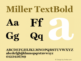
Ever since Tom Alberty became the Design Director of New York earlier this year, the cover typography has sprung to life. Alberty was previously the Art Director at GQ, a magazine that may use more fonts than anyone else. 2012's New York covers have mostly stuck to the their core typefaces:ITC Franklin, Egyptian Bold Condensed, and Miller. However, Helvetica makes an appearance every so often, mostly for special issues, and Futura has started to show up, inside and out.
The Fall Preview is Alberty's most energetic cover yet; it's arguably the magazine's most playful since 2004's major redesign, led by Luke Hayman.

Newsstand cover
Ed GothicandEd Roman, from House Industries's 5-font Ed Benguiat set, are unexpected but pitch perfect. By avoiding the quirkier sides of the Benguiat family (notably, Ed Interlock), the whimsy here is under control. It generates enough excitement without being goofy. Also, it avoids the trap of becoming a poster — something many city magazines fall prey too — by injecting it's core sans serif, ITC Franklin, and by keeping the type sizes in check.
To see several years of New York covers, check out their issue archive.


 闽公网安备35010202000240号