


BBC's Great Expectations Wins 2012 Emmy Award For Outstanding Main Title Design


This weekend the Academy of Television Arts & Sciences presented the 2011-2012 Creative Arts Primetime Emmy Awards for programs and individual achievements at the 64th Emmy Awards presentation at the NOKIA Theatre L.A. LIVE in Los Angeles. The Emmy® Awards recognise excellence within various areas of television and emerging media. The Primetime Emmy Award is a symbol of peer recognition from over 15,000 Television Academy members, with each member casting a ballot for the category of competition in their field of expertise. As typography (and other arts related to the alphabet like calligraphy, lettering, graffiti, etc.) are the main focus of The FontFeed, I am of course interested in Outstanding Main Title Design amongst the myriad categories.
Below are this year's five nominees for the Emmy Awards 2012, with the winner at the end of the list. For additional information check the Art of The Title article.
American Horror Story – Opening Credits from darko on Vimeo.
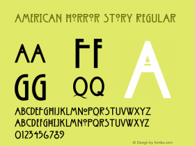
The unsettling sequence for FX's American Horror Story was created by Kyle Cooper – responsible for the seminal opening sequence for Se7en – for Prologue. It includes images of postmortem young children, fetuses in jars, skulls, a christening dress, a nurse's uniform, and a figure holding a pair of bloody hedge clippers. Series creator Ryan Murphy described the sequence as a mini-mystery and stated that "By the time you see the ninth episode of this season, every image in that title sequence will be explained".
As engrossing as the sequence is, as godawfully ugly is the typeface, visibly inspired by Charles Rennie Mackintosh's signature Arts & Crafts display sans but failing miserably.
Imaginary Forces – Magic City from Imaginary Forces on Vimeo.
Michelle Dougherty, along with series creator Mitch Glazer, directed a beautiful underwater shoot for the opening of Magic City, a new series on Starz. The narrow sans looks like a slightly squarer News Gothic/Trade Gothic Extra Condensed, with all-caps Gotham as supporting typeface.
New Girl – Opening Title Sequence from Framework Studio on Vimeo.
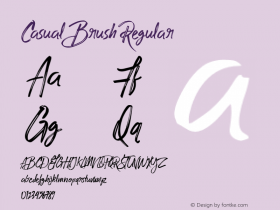
I already saw the sequence for SXSW Film Design Awards evening. Framework also was nominated for an Emmy. Very little type in this one, except something that looks like a hand-rendered and extruded Poplar, and a casual brush sans.
STRIKE BACK from MOMOCO Film Titles on Vimeo.
The main titles for the HBO hit series Strike Back took 10 months to create as Momoco explored a vast array of design directions and editorial decisions. They eventually created two sequences. The version for Sky on the one hand used photographic contributions from friends in the British forces and Photos courtesy of the U.S Army and the Marine's Archive to composite and build a series explosive scenes. The Emmy nominated version on the other hand used a graphic novel direction for HBO and Cinemax.
We didn't want to repeat shots from the drama so we created new scenes before reducing the compositions to stark silhouettes. Shifting textures gives the graphic novel aesthetic an urban feel, reflecting the fabric of the war-torn environments while the credits build on screen as glitching 'satellite data' – as if the letters are being received and decoded.
The military theme is visualised with the strict feel of FF DIN Condensed.
Great Expectations (Emmy Nominated) from MOMOCO Film Titles on Vimeo.
And the winner is… Momoco's title sequence for Great Expectations, the lavish BBC adaptation of Charles Dickens' classic novel, starring Ray Winstone and Gillian Anderson.
We follow the birth and death of a butterfly. In beautifully textural 3D, the creature bursts out of the cocoon, unfurling its fragile self into a dark world. As the sequence progresses we see intricate filigree tattooed onto the wings, growing like creeping ivy.
Eventually the tattoos start to envelop the entire wingspan, patterns over patterns until the creature is blacked out to an eerie silhouette of itself.
The sequence parallels the lead character's evolution – Pip's fascination with Miss Haversham's otherness and wealth before his realisation that all is not as it seems.
Designed & directed by Nic Benns, this title sequence uses a gritty woodtype slab serif. I find this a little bizarre, because it conjures up the American Wild West; correct time period, wrong side of the Atlantic, unless I am not seeing something. It does not seem very appropriate for a story set among the marshes of Kent and in London in the early-to-mid 1800s.
On a side note, I absolutely love how the Momoco website intensively uses Jonathan Barnbrook's Priori Serif and Priori Sans – don't forget to marvel at the impossible Priori Acute, a formidable feat in typographic optical illusion. The Priori series is a daring contemporary re-imagining of the quintessential classic British serif and sans, subtly referring to Perpetua and Gill Sans.


 闽公网安备35010202000240号