


Mobiles Urbanes Wohnen


Source: http://www.ninastoessinger.com.Nina Stössinger. License: All Rights Reserved.
Basel-based designer Nina Stössinger has been commissioned to develop the logo and the overall identity for "Mobiles Urbanes Wohnen". The project included business cards and a simple website.
MUW, which stands for «Mobiles Urbanes Wohnen» (loosely translated as «Mobile Urban Living»), is a Swiss startup specializing in the design and construction of high quality, novel life/work spaces which strike a balance appropriate to modern urban society between comfort, lifestyle, and flexibility.
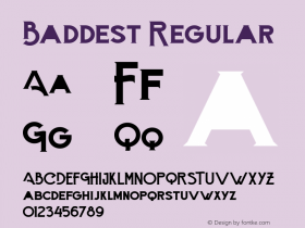
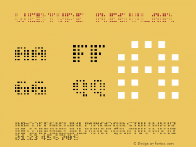
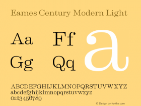
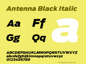
The website runs on Wordpress and makes use of the iA3 Template, which helps to cater for smaller screen sizes. The logo is set in the baddest style of Erik van Blokland's Eames Century Modern, the Black Stencil. For the rest, Nina relied on two screen-optimized fonts served by Webtype: Antenna for logo and headings, Benton Modern RE for text.
http://muw.ch/

Source: http://www.ninastoessinger.com.Nina Stössinger. License: All Rights Reserved.

Source: http://www.ninastoessinger.com.Nina Stössinger. License: All Rights Reserved.

Source: http://www.ninastoessinger.com.Nina Stössinger. License: All Rights Reserved.


 闽公网安备35010202000240号