


The Public Theater logo evolution


Source: http://new.pentagram.com.License: All Rights Reserved.
Pentagram:
In 1994 Paula Scher designed a poster for the New York Shakespeare Festival that introduced a new identity for the Public Theater, a program that would eventually influence much of the graphic design created for theatrical promotion and for cultural institutions in general.
The Public celebrated its fiftieth anniversary in 2005. That same year George Wolfe left and Oskar Eustis joined as artistic director. As part of the organization's anniversary campaign, the identity was redrawn using the font Akzidenz Grotesk. The word theater at the bottom of the logo was dropped, placing even more emphasis on the word public and the organization as a whole, as opposed to a specific location (the theater building).
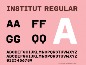
The 2008 identity is even more definitive as the letterforms are now capped by a right-angled period, while the functional sans serif typeface reasserts the theater's mission to provide affordable and accessible productions. To a certain degree, all three version of the logo share a common structure that in the dense spacing of the letterforms, as well as their variant widths and slightly exaggerated verticality, references the architecture of the city. It is this system that has made the logo particularly adaptable for renewal. "You can basically take any version of sans serif font, organize it in the same way and with the same proportions and it would be recognizable as The Public's logo," says Scher. "The system was designed to be flexible, because we knew it would need to be handled by individual designers over the years."


 闽公网安备35010202000240号