


A Typographic Look Ahead At Rio 2016


As straight and angular as the London 2012 font by Alias was, as soft and round is the new custom typeface designed exlusively by Dalton Maag for the upcoming Olympic Games in Rio de Janeiro, Brazil in 2016. One of only a few bespoke fonts created by a Brazilian team, the Rio 2016™ font depicts the theme of the Olympic and Paralympic emblems: Passion and Transformation. Each letter expresses a characteristic of the Rio 2016™ Games, its people and the city. Their shapes are based on the movements of athletes and the topography of the metropolis and the surrounding landscape. The varied curves in the different letters have a unique informality, inspired by the joyfulness of the Brazilian people. The FontFeed talks to Fabio Haag from the Brazilian Dalton Maag office.


Fabio Haag (top) and Fernando Caro (bottom) inspecting prints of the Rio 2016™ custom typeface designed exclusively by Dalton Maag for the upcoming Olympic Games in Rio de Janeiro, Brazil in 2016.
How did you discover typography?
Fabio Haag | "It's funny, I think this was always with me. I found some notebooks from school when I was a child, and I can see several different handwriting styles, changing rapidly from time to time. I also remember being a perfectionist about those notebooks – I would tear down a page and write it all again if I made a mistake.
I got serious about type design after taking a workshop with my now associate Bruno Maag, back in 2002. It was a milestone for type in Brazil. A lot of people who now work with type were there. Actually, the sketches of what became Foco, one of our best selling retail designs today, were made 10 years ago during that workshop.
I discovered I wanted to do type for all my life. I fell in love with it. It's design in its purest form – just black and white shapes, driven by functionality, and yet with an artistic aura in it. The knowledge is so specific and technical, and at the same time, type is so present in our daily life that I felt like I was crossing into an alternate universe. Seeing through the matrix. Fascinating."


Sources of inspiration for the Rio 2016™ typeface: the lowercase 'm' was inspired by the Copacabana sidewalk, and the capital 'T' by the statue of Christ The Redeemer overlooking Rio de Janeiro.
When did you join Dalton Maag?
Fabio Haag | "Around 2005 I had my own graphic design studio which paid the bills, but my heart was set on doing type at nights and weekends. I started ByType in the hope to create a business. I kept in touch with Bruno who was kind enough to offer honest feedback on my type developments. Soon I started reselling Dalton Maag's fonts in Brazil, approaching studios preaching about type and doing talks. In early 2008 Bruno invited me to join his design team, but insisted I should stay in Brazil as he was convinced this was fertile ground for a self-sustaining business.
We were only 3 designers back then and have now grown to a full team of more than 40 people spread around London, Brazil, Austria, USA and most recently Hong Kong. There's no magic as to how we got so big: it's a mix of passion for quality type, business vision and hard work."


Research sketches with calligraphic pen for the Rio 2016™ typeface.
How did Dalton Maag land the Rio 2016 assignment?
Fabio Haag | "Gustavo Soares, the consultant, mapped everyone who produces digital type in Brazil, as well as studios abroad who include at least one Brazilian collaborator and handed an impartial report to the Committee. The decision of choosing Dalton Maag was based on our experience and the necessary structures to support the client."
How did you approach the brief?
Fabio Haag | "The brief was very clear: to create a complete and functional typeface, in two weights, out of the existing 'Rio 2016™' logo, which was designed by Tátil with the assistance of type designer Fabio Lopez.
Although the scope was narrow, creating a matching font based on those few letters and figures was quite a challenge, especially because the construction is so lively and unique. We developed 23 type concepts before arriving at what became the final typeface. Every one of the previous options had roots in the lettering, yet the end result never precisely felt the same as the logo. Something was missing. Before arriving to the final solution, we got away from our computers and went back to drawing with calligraphic pens. We had done that in the beginning, but because we had run a long path of exploration, we realised the final concept was already laying around our subconscious, just within our grasp, waiting to come to life. When it did, every new letter, figure and diacritic sign fell right into place."


Test prints with annotations of the Rio 2016™ typeface.
How was collaborating with the Olympic committee?
Fabio Haag | "They were very professional, so much that they hired a typographic specialist, Gustavo Soares. He sat in at the table from the client side to facilitate the process of designing a font, which is very unfamiliar to most clients in Brazil.
It was a rich process of collaboration, no bullshit. The Committee has a full structure in house, from brand manager, design manager and more than a dozen designers. They were very supportive during the exploration, and when we nailed the final concept, the response was extremely good. Everyone was genuinely happy and excited, looking forward to start using that font as soon as possible."

Inspecting the flow of the connections in the Rio 2016™ typeface.
Was it difficult to create this consistent flow in the design?
Fabio Haag | "It was hard to arrive at this type concept, where the letters flow with vibrant movement, but once we established it for a few characters, it wasn't really hard to expand it into a full typeface. Having said that, people might think that a handwritten font would be easier to draw because it looks careless and spontaneous, but the truth is very different. With a sans serif design you know exactly where every node has to be, but on the Rio 2016 font, every stem, curve and corner had to be considered individually."

Light weight (top) of the Rio 2016™ typeface with annotations.
How many languages do the fonts support? Did you use external consultants for non-Latin scripts?
Fabio Haag | "It supports about 100 languages which use the Latin character set. Non-Latin scripts weren't required for this project."

Font Production for Rio 2016™.
What OpenType features do the fonts support?
Fabio Haag | "This font wouldn't have been possible without OpenType features. It uses a total of 17 features:
The Contextual Alternates feature is the most important, playing 3 roles: it takes care of choosing the right letterform variation to appear, whether it is connecting or not, depending on the letter that follows it; it alternates the design of some letterforms so that identical forms never appear next to each other; and it also increases the spacing between words when it appears between two uppercase words.
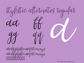
The Standard Ligatures feature allows for a better connection between key pairs of letters; Discretionary Ligatures offer the user the possibility of having more playful connections, including extravagant triple ligatures; Stylistic Alternates act in the same way, but on individual letters.
There are two sets of numerals: the default is proportionally spaced and doesn't have a fixed height, some figures fall a bit below the baseline (3, 5, 7 and 9) and others jump above the usual figure height (4 and 6). The tabular set of figures can be accessed via OpenType, making all figures occupy the same width and respect the baseline and height, for use in tables, for example.
The Rio 2016™ font also uses other features that are expected in any professional font, such as Ordinals, Fractions, Superscript, Subscript and All Caps."

Producing ligatures for the Rio 2016™ typeface.
Were there any technical challenges?
Fabio Haag | "There were several big challenges.
The nature of the design required a jigsaw of OpenType substitutions for the script to flow pleasantly and rhythmically, considering the presence of contextual and stylistic alternates.
Ligatures obviously pose a problem when they involve glyphs with diacritics. For each ligature that contains glyphs with diacritics, all the possible combinations have to be present. This turns out to quickly inflate the number of combinations for double ligatures. When triple ligatures – plus their alternates – are introduced, the number of combinations easily reaches thousands. Solving this problem manually would translate into insanity. For this reason an automatic way to generate accented ligatures has been developed. We have been able to generate these combinations for 93% of the total number of ligatures, without requiring any manual intervention at all. Across 4896 ligatures, for each font, this automation made a big difference to our workload."

From the Rio 2016 website:
Each letter expresses a characteristic of the Rio 2016™ Games, its people and the city. The letters are written in single continuous strokes, with fast and fluid motions, suggesting the movements of the athletes in action. The strong contrast between thick and thin strokes was explored during the design process by putting brush to paper and writing by hand. The variety of the curves in the different letters has a unique informality, inspired by the joyfulness of the Brazilian people.


All images by Dalton Maag.


 闽公网安备35010202000240号