


Birkhäuser Publishes The Complete Works of Adrian Frutiger


There is little doubt that this is the one. Arguably the most important type-related book of the decade has been released: Adrian Frutiger – Typefaces. The Complete Works.
Many people associate Adrian Frutiger with Univers, the typeface that made him internationally known towards the end of the nineteen-fifties. Today one encounters his typefaces daily and on a global scale – in print media, on deposit slips, in advertising, on packaging, on TV, on the internet and in public spaces. But even though much has already been written about the Swiss type designer and he himself also published regularly, his complete work is still not sufficiently known. Even experts have an incomplete knowledge regarding his creation of typefaces.
The book Adrian Frutiger – Typefaces. The Complete Works is based upon a close collaboration with Adrian Frutiger. In it one can find for the first time a complete and detailed essay on the design of typefaces and logos, including so-far unpublished or never-realised typefaces – from the design phase through the final drafting process to its realisation, from the idea to the marketing stage. The more than 50 typefaces and type designs are presented, explained and examined in chronological order on more than 460 richly illustrated pages.
Each typeface is critically assessed in interviews with Adrian Frutiger and placed within its context. These conversations are the basis for the main part of the book, besides the extensive research in specialised magazines, archives, libraries, museums and collections of several countries. Short, technical explanations offer background information on the relationship between the design and production of typefaces.
The concept of the book is aimed at an audience specialised in visual communication, typeface design, typography, graphics, advertisement, print production and architecture/signage – as well as the fields of type research and design at high schools and universities. The large selection of typefaces on personal computers also makes Adrian Frutiger's accomplishments in type available to a wider audience. An examination of Adrian Frutiger's typefaces therefore is also an increasingly important topic for an interested lay audience. In its completeness, objectivity, precision, diversity of illustrations and authenticity this book will doubtlessly become a standard in the field of typographic specialist literature.
The book features introductions by Kurt Weidemann and Adrian Frutiger himself. And the Table of Contents looks fingerlicking good (see below). In between sections there are chapters on the Production of type and Logos and wordmarks by Frutiger. The main content ends with a Synopsis of Frutiger-Typefaces.
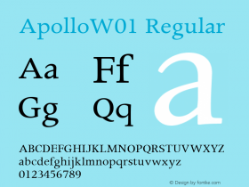
Adrian Frutiger's teachers and mentorsPrésidentDeltaPhoebusElement-GroteskFederduktusOndineMéridienCaractères LumitypeUniversEgyptienne FOpéraAlphabet OrlyApolloAlphabet Entreprise Francis BouyguesConcordeSerifen-Grotesk/Gespannte GroteskAlphabet AlgolSerifaOCRUnivers IBM ComposerAlphabet EDF-GDFKatalogDevanagari/TamilAlpha BPDocumentaAlphabet FacomAlphabet RoissyAlphabet BrancherIridiumAlphabet MétroAlphabet Centre Georges PompidouFrutigerGlyphaIconeBreughelDolmenTiemannVersaillesLinotype CentennialAvenirWestsideVectoraLinotype DidotHerculanumShiseidoFrutiger CapitalisPompeijanaRusticanaFrutiger Stones/Frutiger SymbolsFrutiger NeonscriptNami
Adrian Frutiger – Typefaces. The Complete Works
Heidrun Osterer, Philipp Stamm, Schweizerische Stiftung Schrift (Eds.)
462 pp. 430 colour, 620 b/w ills.
24,5 x 31,0 cm, clothbound
ISBN 978-3-7643-8581-1 English
ISBN 978-3-7643-8582-8 French
ISBN 978-3-7643-8576-7 German
© Birkhäuser


 闽公网安备35010202000240号