


Familienmacher


"Familienmacher" (Family Maker) was an exhibition held at the Austrian Museum of Folk Life and Folk Art in Vienna from November 12, 2011 through March 25, 2012. Its subtitle translates to "To Hold on To, to Connect, to Get Rid Off".
Who are you related to? Who takes the family pictures? How many of your kin are in your phone? Where do you store unloved heirlooms? Where to put the photo of the baby-bump? Whose picture to put into the frame? Does a family have a nationality? The exhibition is based on ethnographic research in the 8th and 16th district of Vienna.

Wolfram Wiedner studio created the identity and the exhibition graphics together with Johannes Lang. The exhibition interior and installations were designed by Kathrina Dankl. In 2012, "Familienmacher, Ausstellungsmachen", an accompanying exhibition catalogue was released.


The exhibition logo is a purely typographic representation of the concept of family. The word Familienmacher is assembled of five diverse pieces, each of them set in a different and idiosyncratic typeface. None of them share a baseline, still all of them are united by the color red.

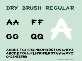
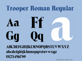
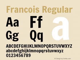
The selected typefaces include several of my favorites, many of them underused.Reporteris an energetic dry brush script from 1930s Germany. The marvelously angularScriptek Italicis inspired by Russian Construcivism. WhileGoudy Sanshearkens back to the 1920s, the Bold Italic that is used here is a much younger addition.Trooper Romanis a high-contrast display face from the 1960s, digitized under many names including Troover Roman and Toledo. The last typeface does not only have the weirdest look, but also the weirdest name:Gneisenauette Black Alternate.
For everything else, the designers chose a very neutral face:Theinhardtis a revisited and refined Akzidenz-Grotesk by François Rappo.


 闽公网安备35010202000240号