


This Jumpy Font Has Had a Few Too Many Cups of Coffee

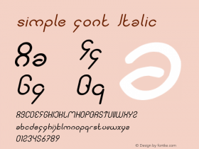
There are all kinds of fonts out there, but they pretty much all have one thing in common: they're rigid. Typode, on the other hand, has its characters defined by coordinate so they can skew, stretch, twist, and do all kinds of neat-looking, hard-to-read tricks.
The idea behind Typode, aside from looking cool, is that it can be used in situations where it might be helpful for text to sort of evolve to compliment its surroundings somehow. As its creator Santiago Ortiz explains:
"Typode is a simple font described with coordinates so it can be freely reshaped, distorted, or mapped. I created it to be used in certain information visualization contexts, in which text needs to adapt to specific shapes."
There are surely a number of novel applications for this malleable font that involve more than just doing a little dance. But in the meantime, that's pretty cool as well. Hop over to Ortiz's site to play with it and spend a little time being a font-charmer. [Santiago Ortiz via The Next Web]


 闽公网安备35010202000240号