


-

上周五,北京中易中标电子信息技术公司起诉美国微软公司违法使用郑码输入法、侵犯了中易公司的相关知识产权。微软中国公司对此立即做出回应,全盘否认微软有侵权行为并表示有书面协议“微软在其所有产品中使用中易字体和输入法编辑器”的授权。据国外媒体报
术语 赛迪网 2008-01-21 19:27:17
-
小林章(假名:こばやし あきら;罗马字:Kobayashi Akira)是日本一位著名的字体设计师。最初在写研印刷所工作,之后设计了ヒラギノ明朝、AXIS体的西文部分,在日本被誉为西文字体第一人。现任Linotype公司的字体总监,进行字体设计的指挥策划,进行了Optima等着名字体
人物 视觉同盟 廖翔 沈扬 2008-01-19 21:36:40
-
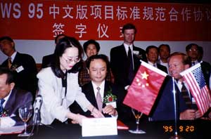
下面是来自中易公司公关部的消息:2007年12月19日,中易方律师收到北京第一中级人民法院(以下简称“一中院”)转来的美国微软提供的证据。2008年1月8日,“一中院”书面通知中易代理律师,此案订于1月15日上午9时在一中院第20审判
知识 中易公司 2008-01-16 10:50:53
-
三四十年前,打字机代表了“文字工作机械化”的方向。连原中国科学院院长郭沫若都觉得,西方作家把字母打字机背在包里,在飞机上也能写小说,简直令人艳羡。 徐静蕾的手写字体被收入方正字库,在网上风靡一时。 数字技术加快字体设计 从本质上
业界 《人民日报海外版》 杨健 2008-01-04 22:43:42
-
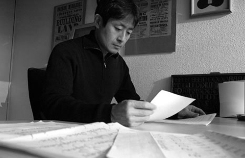
小林章是日本一位著名的字体设计师。Akira Kobayashi是一个地位巩固的世界知名字体设计师。他种类广泛的字体作品包括了从展示字体、经典作品重修和许多套坚实的正文用字体这一完整范围。在过去20年间,他在众多字体竞赛中获得殊荣,为无数字体工厂设计字体,在日本教授
人物 新浪博客 朴雨 2007-12-30 19:25:44
-
12月17日,“字体的明天——汉字字体价值重构”国际研讨会在京召开。这场由中国印刷技术协会与北京大学计算机技术研究所联合举办、由北京北大方正电子有限公司承办,专门针对汉字字体未来设计及运用的国际研讨吸引了国内、外字体设计师、平面设计师
业界 北京北大方正电子有限公司 2007-12-18 21:56:24
-
Windows XP操作系统我们知道把你所需要的字体下载好了以后,解压后打开你的要的字体,复制或剪切,然后打开C:WINDOWSFonts文件,在文件的空白处点粘贴,粘贴后你就可以在QQ上或者Photoshop等软件上使用此字体了。但是你知道在Windows Vista操作系统中如何添加并使用字
应用 天极网 陌上归雁 2007-12-18 08:45:40
-
-

2007年12月16日,备受各界关注的第四届“方正奖”中文字体及海报设计大赛评审工作如期在方正大厦拉开了帷幕。评委们评审中文字体设计最终获奖作品评委们评审海报设计最终获奖作品“方正奖”中文字体设计大赛旨在将古老的汉字
业界 北京北大方正电子有限公司 2007-12-16 21:58:27
-
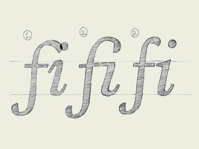
Ligatures. In a very few cases they are essential. Some well known ligatures are 'fi' and 'fl'. The inevitable need for a ligature is depending on the design of a font. Not every typeface will need a ligature for a 'fi' combination. But in some cases
设计 typeworkshop.com 翻译/snlchina 2007-12-01 23:46:26
-
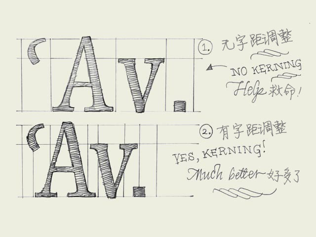
Kerning. Knowledge about kerning will give a deeper understanding of type. However, forget about kerning for now, spend your time on other things. It's much more important to properly space your characters.字距调整的知识会让你对字体的理解更进一步。
设计 typeworkshop.com 翻译/snlchina 2007-12-01 23:45:40
-

Balance shapes. If you make both of the inner forms (counters) of the 'B' exactly the same, the top counter will optically look bigger. Your character will look plumby, like it's falling down. If you make the top counter smaller than the bottom one,
设计 typeworkshop.com 翻译/snlchina 2007-12-01 23:44:46
-

Copy-paste? When you have created a few basic characters, you also want to create the rest of the alphabet. But how? Copy and paste? Euhm, not really. Although, this can help you on the way.当你设计了几个基本的字符,你还想继续完成整个字母表。该怎样
设计 typeworkshop.com 翻译/snlchina 2007-12-01 23:43:37
-
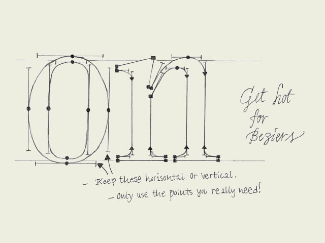
Digitizing sketches. When the handmade sketches on paper are ready to be scanned, take care of digitizing them in a proper way. More specifically, take care while converting your scanned image manually with a Bezier based pen tool. Too many points on
设计 typeworkshop.com 翻译/snlchina 2007-12-01 23:42:40
-

Bold-faced. Since the introduction of the computer, type design has become available to a wide audience like never shown before in history. Of course the digitalization makes many acts easier and particularly faster. This doesn't mean it automaticall
设计 typeworkshop.com 翻译/snlchina 2007-12-01 23:41:20
-

x-heights. If you make a light weight and the black weight of one typeface, you'll have to make sure that the black weight has a bigger x-height than the light weight (top line drawing). If this is not the case, the black weight will look optically t
设计 typeworkshop.com 翻译/snlchina 2007-12-01 23:40:24
-
文字是我们在设计中不可缺少的重要元素,丰富的字库给设师提供了广阔的创作空间,下面我们来详细了解一下常用的字库,如GBK、PostScript、CID、TrueType字库等。 一、GB字库全称GB2312或GB2312-80是一个简体中文字符集的中国国家标准,全称为《信息交换用汉字编码字
设计 蓝色理想 2007-11-29 06:53:07
-
日前,唐山乐亭县青年书法家大畅的独创书法字体“珍珠隶”,经过所签约的北京汉仪科印信息技术有限公司验收合格,被定名为“汉仪珍珠隶”收入国家电脑字体。大畅先生因此而成为继舒同、启功、王祥之、刘炳森之后被收录到字库的第五位书法家,也是最
业界 中新网 孟庆忠 徐海英 杨盛东 2007-11-25 21:48:25
-
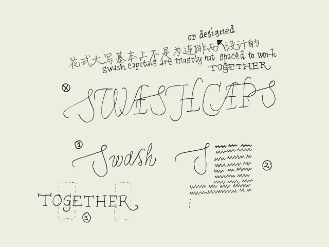
Swash caps? Admitting that it's not the most urgent issue to learn in typography, it's interesting to quickly pay attention to this topic. Not every font family has a Swash variant. Most common are swash capitals, but also swash lowercase characters
设计 typeworkshop.com 翻译/snlchina 2007-11-19 23:37:19
-

Small caps. You could guess it already from the name, small caps are small capitals. Capitals which have the same height as lowercase characters.你可能看名字就猜出来了,小型大写就是小号的大写字母。和小写字母一样高度的大写字母。Why are small caps
设计 typeworkshop.com 翻译/snlchina 2007-11-19 23:36:20
-

Proportions. Which x-height to define? Which descender depth? Defining these proportions are essential, and very strongly connected to the purpose of the type. The proportions within a certain typeface are influencing the way your type will work &
设计 typeworkshop.com 翻译/snlchina 2007-11-19 23:34:03
-
Readability. The only important aspect of a text typeface is the readability. Many decisions can influence the readability. Which contrast you create, the length of the ascenders and descenders, the rhythm, the blackness of a type, the strength
设计 typeworkshop.com 翻译/snlchina 2007-11-19 23:32:56
-
One for all What defines if one character can fit to another character? Once you made a decision, how to apply this to all the other characters in a font?是什么决定一个字符能否匹配另一个字符?当你确定了一种风格,如何将之推广应用于字库中的全部字符?
设计 typeworkshop.com 翻译/snlchina 2007-11-19 23:31:53
-
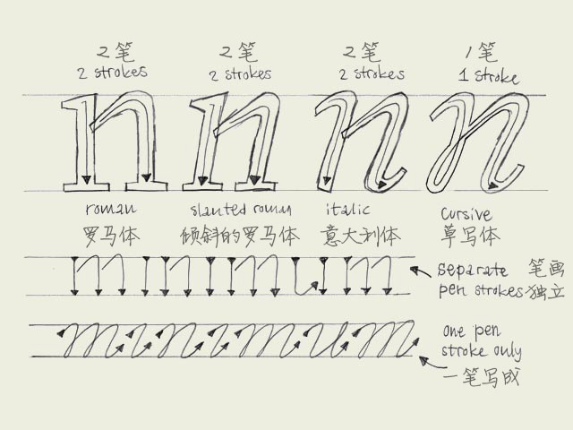
Italic vs. cursive. A roman font can be slanted (having an angle) and a cursive font can be upright (totally vertical like a roman). Urgh!一个罗马体(roman,通常也被译作”正体“)可以是倾斜的(有一定的倾角),而一个草写体可以是竖直的(就
设计 typeworkshop.com 翻译/snlchina 2007-11-15 23:29:21
-

Black vs. white. Designing type is nothing more and nothing less than harmonizing black and white shapes. Black can't exist without white, and white can't exist without black. Black, the shape of a letter. White, the space in or in between letters. T
设计 typeworkshop.com 翻译/snlchina 2007-11-15 23:28:15


 闽公网安备35010202000240号