


-
A few things I've learned about typeface design
Teaching on a postgraduate course feels very much like a spiral:
-
Submissions Open For Letter.2 International Type Design Competition
 On Monday, April 4, submissions opened for Letter.2 – the second
 -
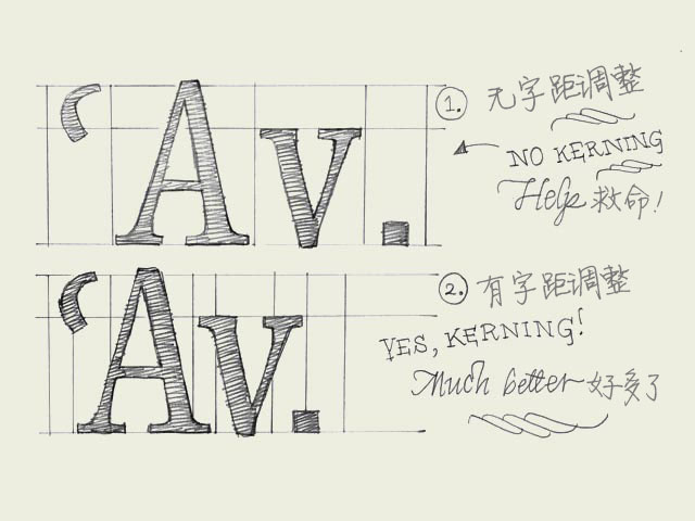 Kerning. Knowledge about kerning will give a deeper understanding of type. However, forget about kerning for now, spend your time on other things. It's much more important to properly space your characters.字距调整的知识会让你对字体的理解更进一步。
 -
ScreenFonts: Fast & Furious, The Escapist, Crank: High Voltage, State Of Play, Obsessed
 In ScreenFonts I always try to have a mix of mainstream movies an
 -
Mota Italic Gallery Celebrates First Anniversary With Pre-TYPO Berlin Party
 Last year after landing in Berlin Schönefeld the Wednesday evenin
 -
Norwegian Bible, 2011 Editions
 The Standard edition of the 2011 Norwegian Bible. The cover is a
 -
Monotype Imaging, EOT Friendly License
Monotype Imaging Introduces New Font License to Permit Use on Non
-
Album Packages for Reckless Kelly and Paul McCartney & Wings Win Grammy Awards
 Yesterday The Recording Academy presented the 56th Grammy Awards,
 -
Why Apple Abandoned the World's Most Beloved Typeface
The world's most beloved typeface has been dumped.After two rocky
-
 排版印刷是最为关键的设计元素,因此,为你的项目找到最适合的字体就是一项富有挑战性的任务了。今天我们将让你轻而易举就可以找到合适字体


 闽公网安备35010202000240号