


-
 U&lc ceased print publication in the fall of 1999. Over its almos
 -
 When the FontFeed featured a brief review of "Typography for Lawy
 -
The 52 best free graffiti fonts
 In recent decades, graffiti has moved from an urban nuisance to a
 -
 Balance shapes. If you make both of the inner forms (counters) of the 'B' exactly the same, the top counter will optically look bigger. Your character will look plumby, like it's falling down. If you make the top counter smaller than the bottom one,
 -
Brand Perfect Tour Hamburg Review
 We were more than overbooked for the second event on the Brand Pe
 -
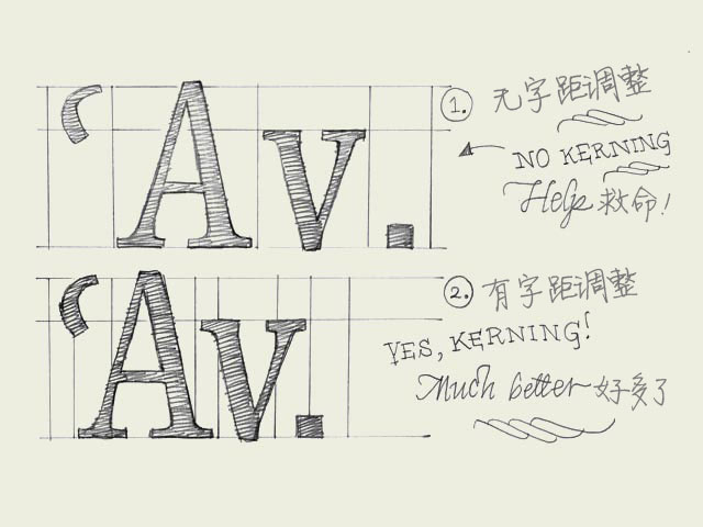 Kerning. Knowledge about kerning will give a deeper understanding of type. However, forget about kerning for now, spend your time on other things. It's much more important to properly space your characters.字距调整的知识会让你对字体的理解更进一步。
 -
Glyph Corrections Via AFDKO Tools—Redux
 As described in the August 24, 2012 article, I am currently updat
 -
ScreenFonts: J. Edgar, Immortals, The Twilight Saga: Breaking Dawn, Hugo, The Muppets
 ScreenFonts is now enjoying a parallel career on stage. After bri
 -
Program Announced for 35th Internationalization and Unicode Conference (IUC 35)
Mountain View, CA, USA--June 1, 2011--The Unicode® Consortium tod
-
My Type of Music: April's Fool 2014 Special
 I had been slipping a little when it comes to My Type of Music po


 闽公网安备35010202000240号