


-
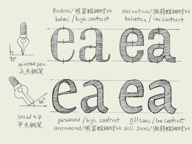 Calligraphic origin. The characters on the top line have a different construction than the characters on the bottom line. They have a different calligraphic origin. It doesn't matter if a typeface has serifs (like Times New Roman) or not (like Arial
 -
 Source: https://www.flickr.com.Uploaded to Flickr by Indra Kupfer
 -
Marianina Extended Font Family (24 Fonts) – only $27!
The Marianina Extended Font Family is a beautiful, contemporary s
-
 Balance shapes. If you make both of the inner forms (counters) of the 'B' exactly the same, the top counter will optically look bigger. Your character will look plumby, like it's falling down. If you make the top counter smaller than the bottom one,
 -
 Source: https://www.flickr.com.Cake Cafe. License: All Rights Res
 -
German Stamps by Henning Wagenbreth
 Each year, the Federal Ministry of Finance of Germany issues appr
 -
A great deal to get a professional font family with a 80% discoun
-
New FontFonts: The Creation of FF Unit Slab
 One of the things the FontFont foundry is known for are its succe
 -
Something fell between the cracks!
 A peculiar series of events that took place on April 1st (no joke
 -
Proposed Update UTS #18, Unicode Regular Expressions
UTS #18, Unicode Regular Expressions, is being updated to bring i


 闽公网安备35010202000240号