




-
Gill Sans, One of History's Most Popular Typefaces, Gets a Major Upgrade
British designer Eric Gill created Gill Sans in 1928. Today it is
-
衬线体(Serif)指的是有衬线的字体,又称为“有衬线体”(中文惯用名称“白体”),而与之相对的,没有衬线的称为“无衬线体”(中文惯用“黑体”)。衬线指的是字形笔画末端的装饰细节部分。无衬线字体在西文中习惯称sans-serif,其中sans为法语的
-
Fonts, Branding and the 2010 Winter Olympics
 Type is one of the most important aspects of any branding solutio
 -
 Two graphic designers, Matthew Robinson and Tom Wrigglesworth, de
 -
 If you were to design a traditional mom-and-pop butcher shop,Brot
 -
London Underground's iconic Johnston Sans typeface
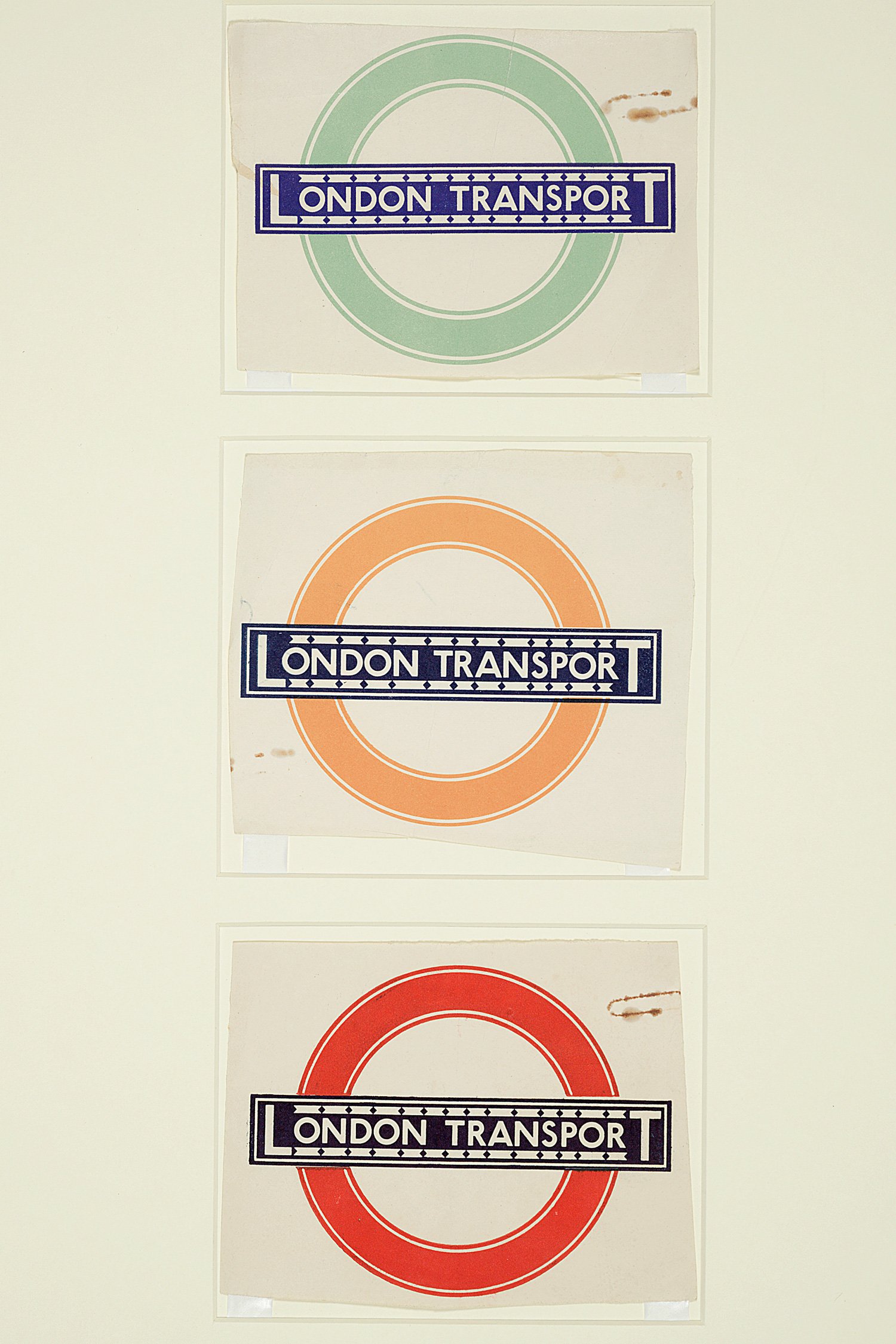 Looking back on the centenary of the font that for many means 'London'.
-
Linotype launches new type system Generis
Linotype has released a new type system called Generis. Inspired
-
Püterschein Opines on Metro Nova
 Bill Dwiggins got me hooked on type. His marionette shows were wh
 -
就像是比较黑体和宋体,想要发现两个不同字体间的细微差异是挺不容易的。举个例子:未经训练过的眼睛,是很难看出Helvetica和Ar
-
Classic Grotesque – A Distinctive Sans for the 21st Century
 The name says it all. The Classic Grotesque™ typeface family has



 闽公网安备35010202000240号